Vinted — Making Second-Hand Experience the First Choice
Introduction
Vinted is a social marketplace for second-hand clothes with more than 20 million active members across 10 countries, and a vision of making second-hand purchasing experience first-choice.
I’ve joined Vinted in early 2014 — in the midst of company and market expansion as a front-end developer, but having the passion and experience, I began to design as well. The company saw my efforts and in few upcoming months, decided to give me a permanent role in product design — a possibility to work on web and mobile experiences.
During this time, I worked on projects ranging from the personalization of a feed, onboarding, safety and trust improvements, buying and selling experiences to video stories, editorial, help center or members collections. I’ve also had an opportunity to lead eight designers team, while mainly focusing on design organization scale, impact and vision across Vinted products.
I will focus only on the projects, that made the biggest impact on product and experience.
Help Center
Successful user journey at Vinted was always a challenge, especially, for new users. We’ve tried to simplify it, however, FAQ and Support Center remained main channels for users, who were looking for a help. Once we’ve started scaling to new countries, these channels weren’t efficient enough and we’ve decided to do a major rework.
After research, I've decided to dedicate the first section of Help Center to user transactions, as this was the most painful area for both new and old users. By knowing the status of each transaction, we've been able to suggest personalized answers or pre-fill the contact form with useful information.
With the help from the support team and content writers, we've grouped all questions into action-driven sections and grouped these sections into generalized areas. We've also rewritten all answers focusing more on step-by-step instructions and platform differences.
Also, instead of exposing direct access to the contact form, we've made it accessible only as the last resort — in specific questions, while using search or leaving a feedback.
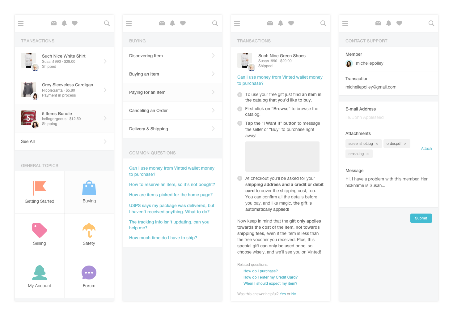
After several iterations with different content display and layout, we've decided to release updated Help Center. And, though, NPS score temporarily dropped, we've dramatically decreased the number of support tickets.
Safety & Trust
Safety and trust are one of the key elements for the successful community-driven marketplace. We believed that by improving these aspects we will be able to bring more users to our platform and, more importantly, help them sell their clothes.
As I’ve started doing research, I understood, that fraud and cheating cases at Vinted were truly rare — mostly resolved by other projects. But due to the complicated representation of user rating and feedback, it wasn’t that obvious.
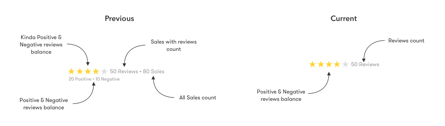
So I’ve decided to change how ratings are being calculated and displayed:
- Removed sales count as sales without reviews weren't truly valuable.
- Removed legacy positive/negative feedbacks count as it only confused our users.
- Updated rating calculation rules for more precise reflection of members feedbacks.
I’ve also had to update feedback leaving flow itself — due to the legacy feedback system, users were leaving positive/neutral/negative feedbacks, which in the process were converted to a five-star rating. Also, they didn’t need to make a sale in order to get a feedback — community forums and clothes sales feedbacks were the same.
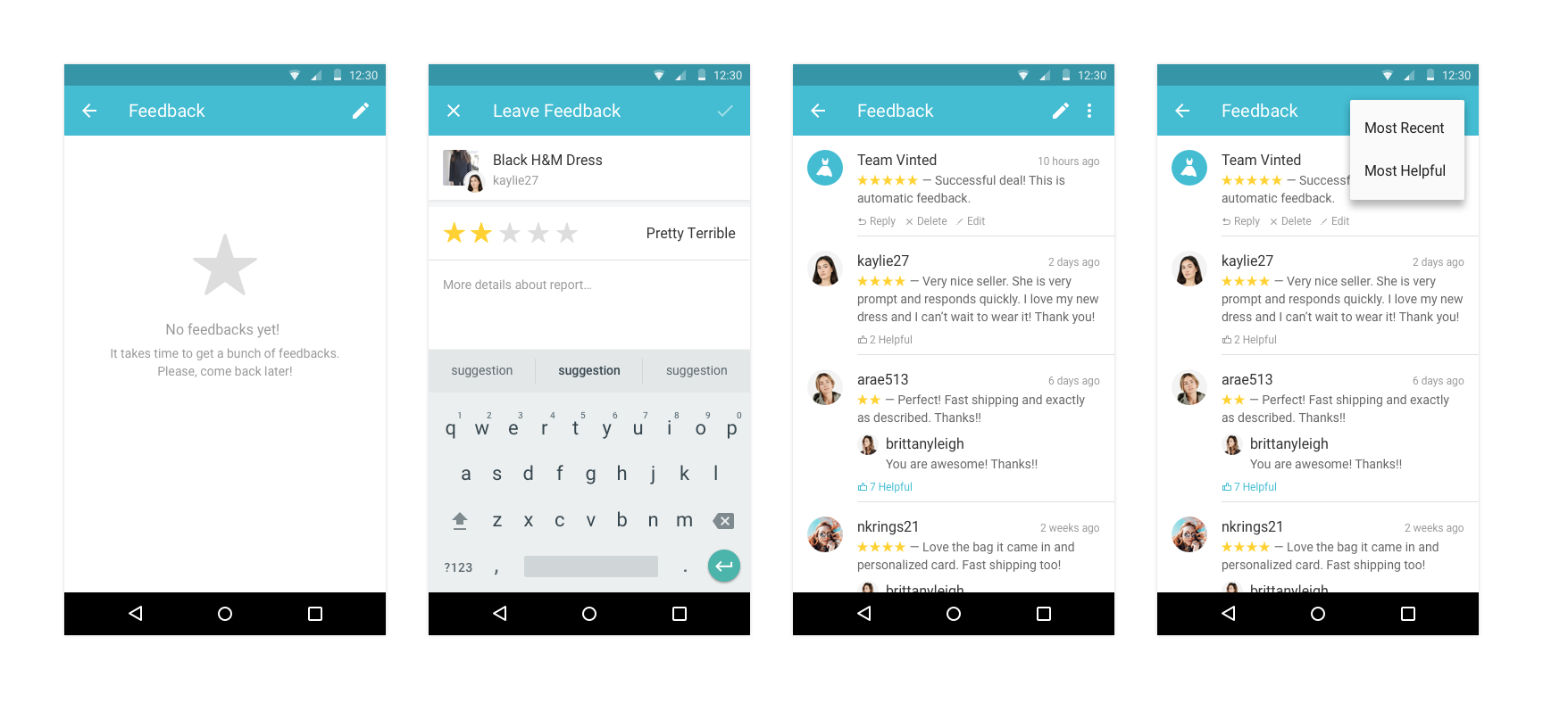
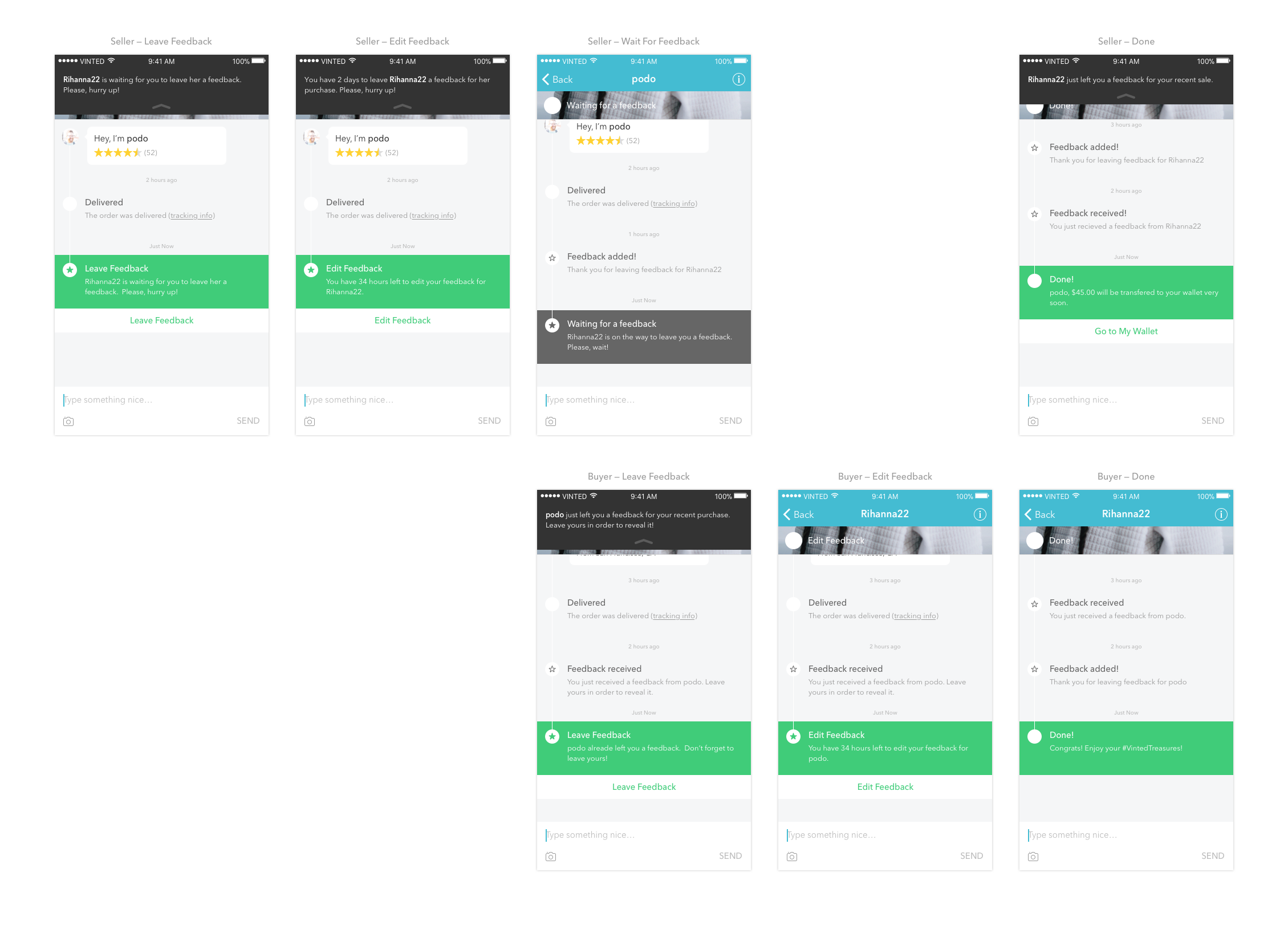
New feedback flow contained same five-star rating with clear names and a possibility to sort feedbacks by most recent or most helpful. I've also improved seller-buyer conversation: added notification reminders about feedbacks that needs to be left, added feedback timer, which would leave automatic feedback once expired, and decided to display feedbacks in profile only when both sides (buyer and seller) left them.
Feedback display improvements were a major success for our top users with a lot of feedbacks, but not for our new users with no feedback at all. Having that in mind, I've decided to rethink how we present user profile and add more trust identifiers.
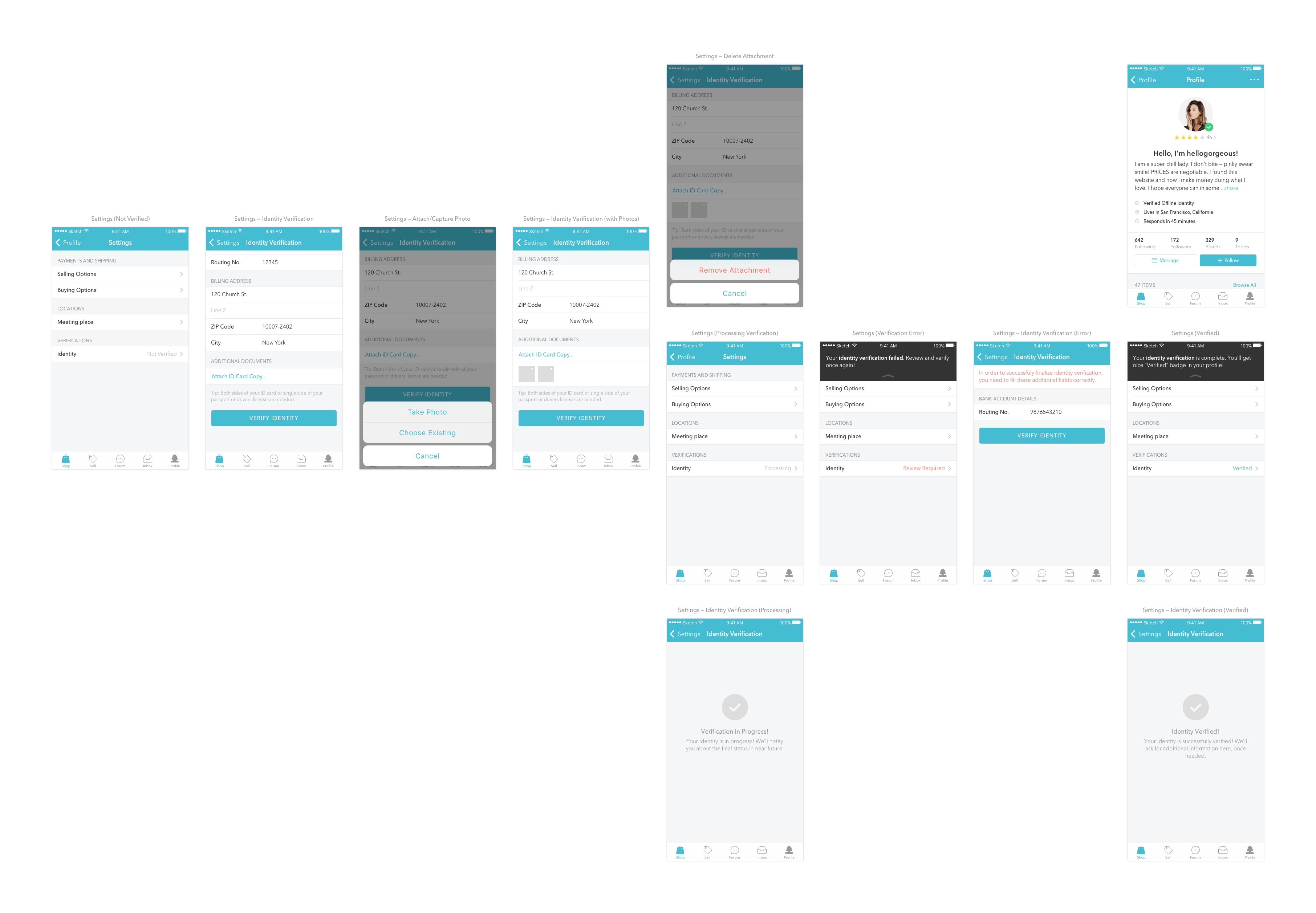
By implementing additional verification layers (ID and bank verification) to already existing ones, users would be able to improve their profile quality and, in consequence, look more trustful without making a huge number of sales.

This also meant, that we can improve the personalization of the profile, as it was the front of users clothes stores. For this reason, I've added customizable background cover and a possibility to add more details.
After exploration with multiple layouts for different platforms, empty states, badges system and personalization details, the new profile was ready to see the daylight. And, being aware that changes will cause a major discussion in our community, we had to prepare an extensive communication.
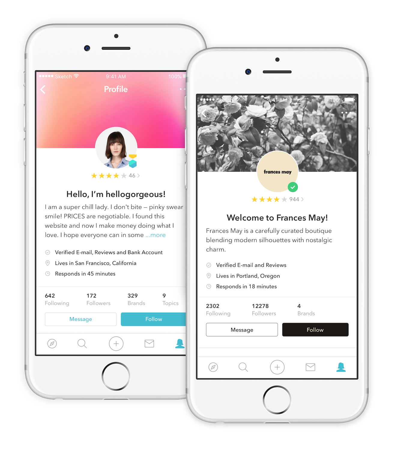
We did stage rollout of the updated profile with new feedback and verifications across all our countries, and saw immediate improvements in items sold per user, which was a good indication, that we've done an amazing job!
Design System
Product designer at Vinted designs for three platforms — Web, iOS, and Android. So, designing UI would always take much more time than problem research or solution exploration. Once I’ve started leading our design team, I set myself a goal — to fix our design process.
We’ve started having weekly user exposure hours, built guild roadmap, defined design vision, and principles, but having experience in both design and development, I’ve also started thinking how to improve the design-to-development process.
“Design system goal is not a consistency, but improvement in the design-to-development processes. Consistency is only a consequence of good processes.”
At the same time, we’ve also started working on new brand execution, which meant that redesign of both web and apps was inevitable. So, I came to the conclusion, that having a design system independent from a platform, but tightly maintained by designers and developers, would improve these processes and make the redesign much faster. Following argument was the main selling point for our management team.
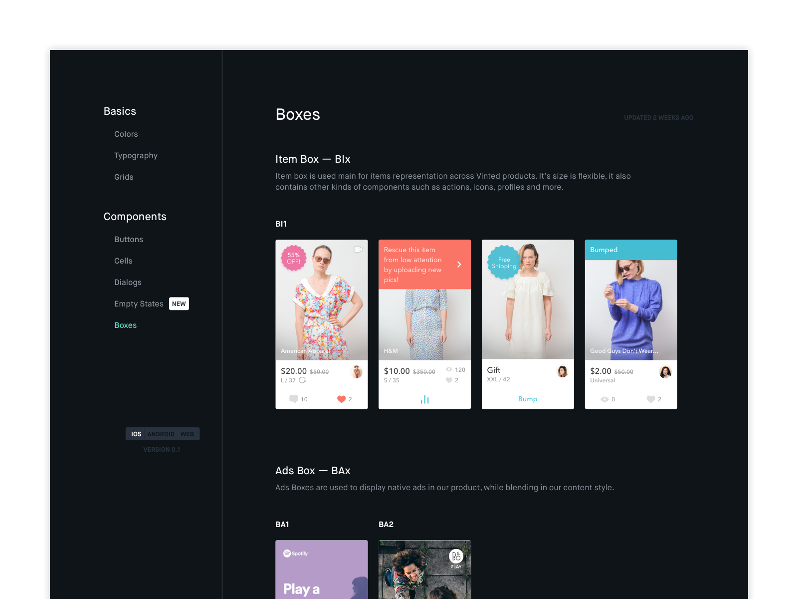
I’ve started with an audit of user interface across all platforms, as it allowed me to find repeating patterns and create a list of components with possible variations. I’ve also created a landing page — a single source of the truth, where our designers and developers could discuss, review and maintain our design system components while focusing on three guiding principles:
- Constraints should be shared across all platforms.
- Designer and developers should talk in the same language.
- Design system should have clear maintenance and update processes.
The components were separated into three groups — atoms, molecules, and organisms (based on Atomic Design principlesBrad Frost — Atomic Design). They had specific properties, which defined variations, and shared same primitives — spacings, color themes, and styles.
It took us nearly three months to design and code cross-platform components, but once developers started updating applications, we've noticed the results — designers began spending less time drawing pixels, which led to more focus on user experience and developers started to speak the same language, which led to more focus on quality and consistency.
Mobile Ads
From early days, web advertising was one of the main revenue sources for Vinted. Even though we’ve introduced seller or buyer fees and added premium services, it was crucial for us to explore possible alternatives such as mobile advertising.
At first, I was skeptical, as creating and maintaining good experience in a marketplace with user-generated content is already difficult, but adding ads meant, that we will need to focus on advertisers content as well. However, I’ve accepted the challenge, because I’ve seen good examples such as FacebookFacebook Ads, InstagramInstagram for Business, and TwitterTwitter Ads.
I knew, that for the first iteration we won’t put much focus on the personalization of the ads — we needed to prove that integration of third-party advertisement providers actually works. So, my mission was pretty clear — find the best ways of ads integration into the content, which wouldn’t decrease our core experience metrics and, at the same time, would increase our revenue.
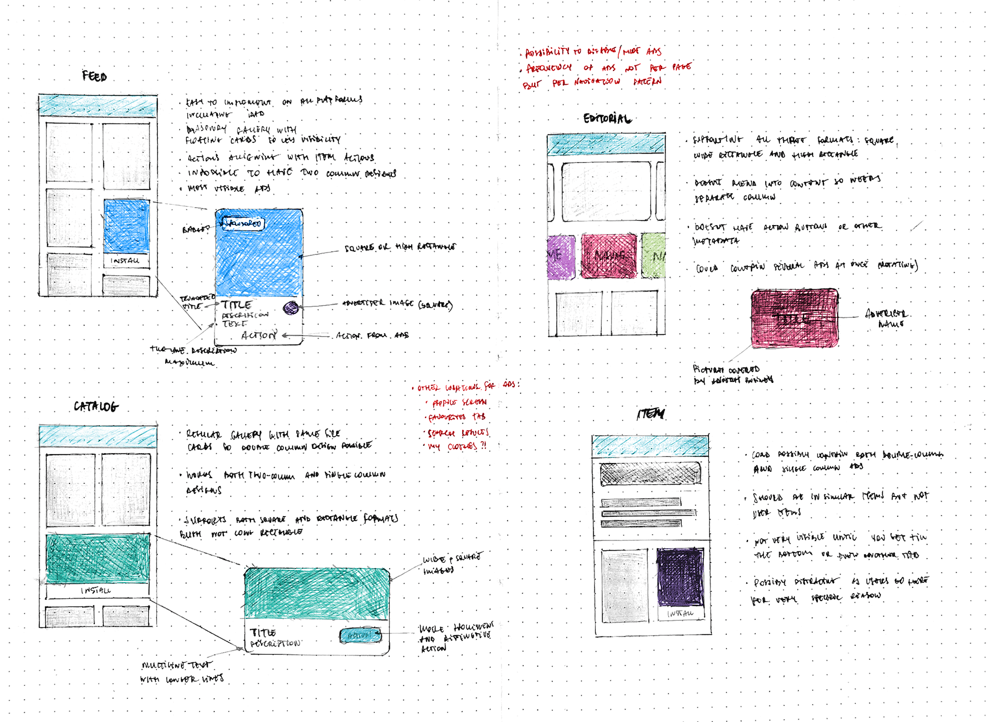
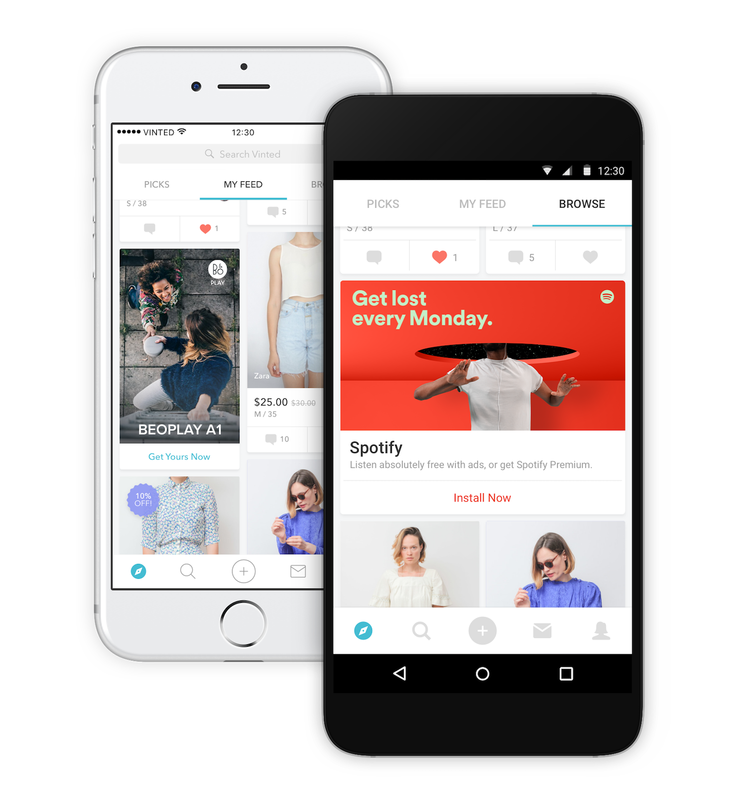
After discovery and exploration phase, I came with the conclusion, that the most natural form for our mobile ads would be item card — element, which we use to show sellers items, as it would blend into content across feed, catalog, and member profile. On top of that, we could have an additional section for ads in our personalized editorial screen.
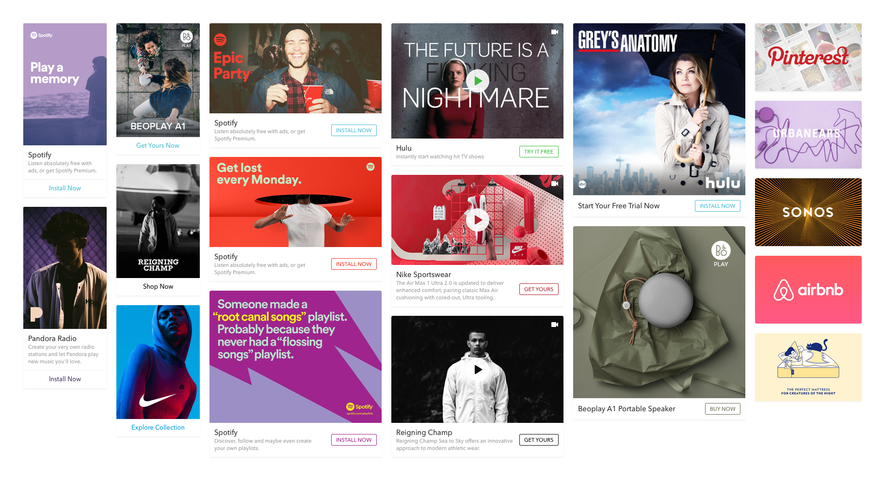
I came up with several different types and formats of ads, which could be adopted for different advertisers and displayed in different pages — only with title and image, with playable video, double-column, single-column and square variations.
We took some time to test different locations and display frequencies, and in couple months mobile ads revenue started climbing, but NPS and app usage metrics remained strong.
Conclusion
In the period of 3 years at Vinted, I had an opportunity to not only transform myself from front-end developer to lead product designer, but more importantly, make an improvement in almost every part of the product.
I've also understood, that measuring the impact of the changes you've made is as important as defining and following a good design process, so I took these lessons to my future endeavorsTrafi — Case Study.