Trafi — Finding the Better Ways of Moving Within a City
Introduction
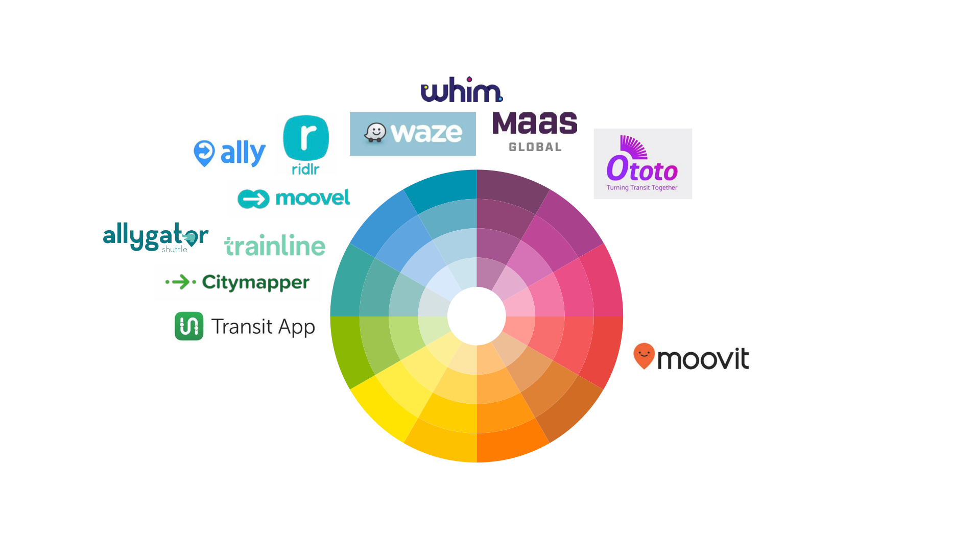
There are multiple means of moving within a city — public transport, car sharing, car-hailing, bike sharing and more, so choosing the best way might get very difficult. But patterns of moving variates not only per person — income or social level, genre, time of traveling, distance, understanding of comfort, however, also per city — size, urban planning, number of transportation types, economic development level, seasons and more.
Trafi started as a product mainly focused on public transportation in Baltics, however, as it grew and moved to more diverse markets, it was crucial to understand the differences and accordingly adapt to expanding users needs.
I’ve joined Trafi as a Senior Product Designer with a goal of making it both a global brand and more localized product, as it prepared for the launch in emerging markets.
“How to create an experience — global as a brand, local as a city and personal as a unique individual, which would help you find a better way of moving within the city?”
Research & Analysis
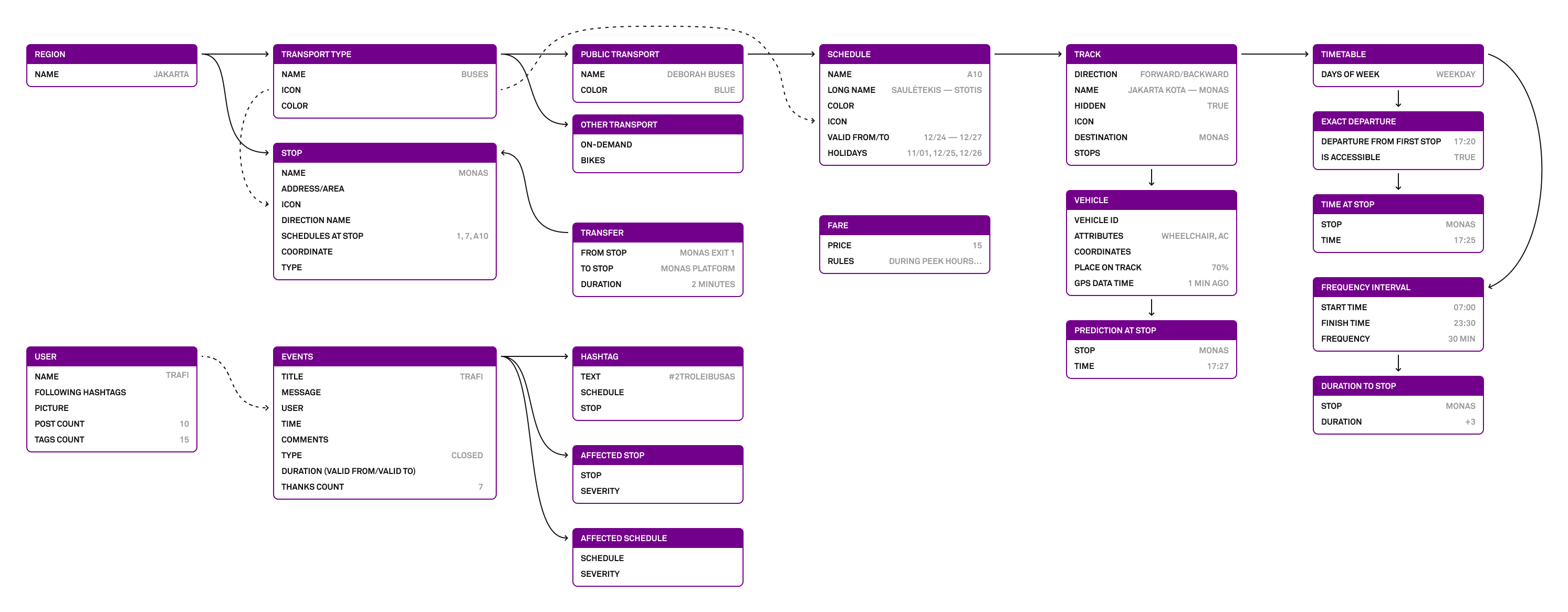
From day one I understood, that in order to get the grasp of the complexity I’m dealing with, I needed to map the information architecture of our product, as it heavily implies the hierarchy of the screens, but not necessarily the mental models of our users.
I also had to identify already existing user problems. For that, we’ve started conducting weekly interviews with users and decided to do some field studies — travel to our new markets in Jakarta, Bangalore, Delhi, Mumbai, and Pune.
After doing tens of user interviews, market and competitors research, BI analysis and several product ideations, I’ve managed to define several crucial areas to tackle:
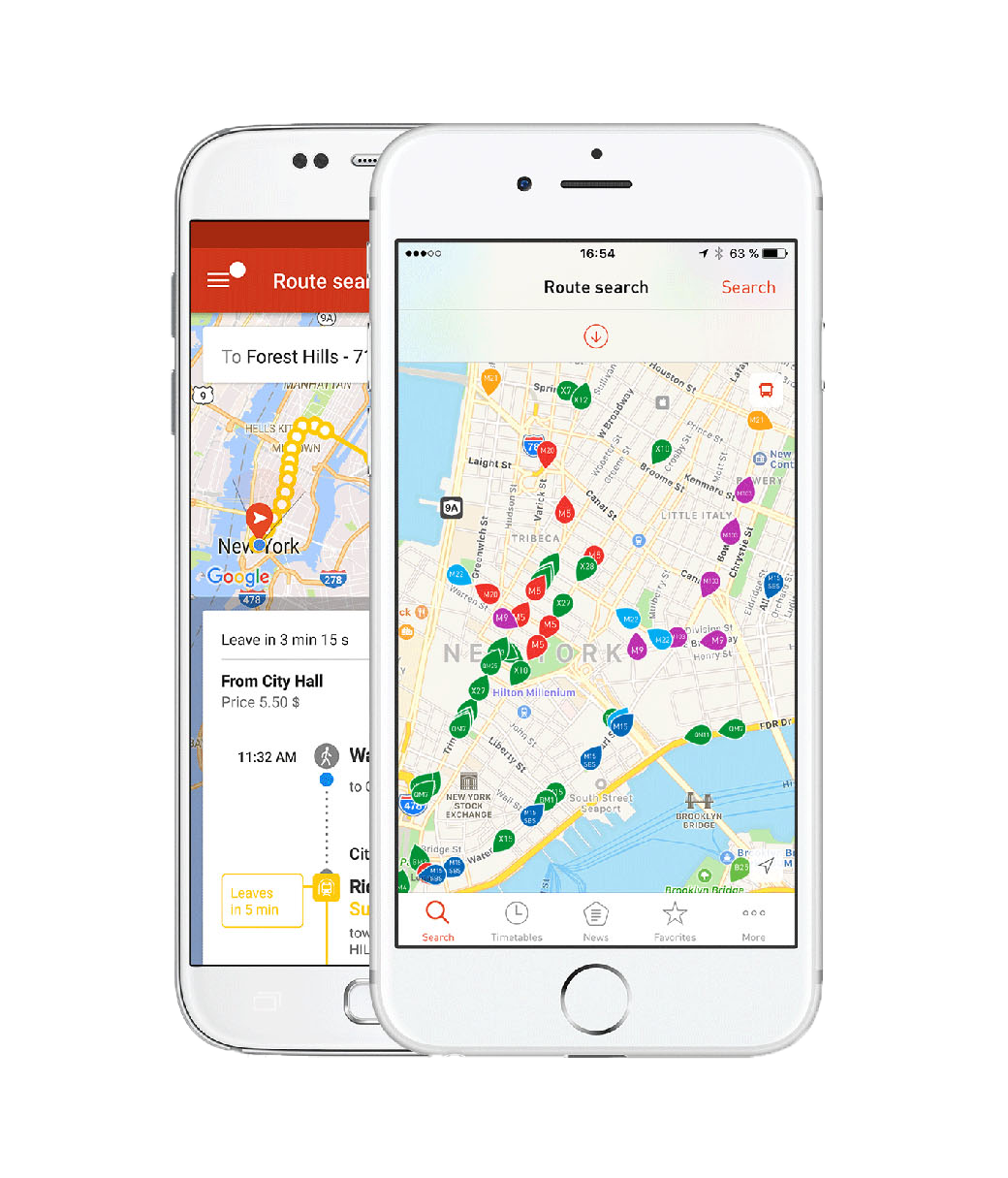
- Trafi use-cases are separated into two big categories: route search and schedules. In order to expose them and create a more personalized experience, we had to create a gateway screen.
- To adopt UI for specific transportation types, we had to rethink transport lists, track, stop and times screens. In short, redesign a whole flow.
- Users got lost in the application, as some of the screens looked too similar and identical elements looked differently — we had to create a design system.
- Web product had to catch up with mobile counterparts in user experience and be optimized for search engines.
- Trafi didn’t have any branding material or branding strategy, so it was crucial to have it for upcoming launches.
This was the list of main issues to focus on while fixing smaller user experience issues along the way. And, by measuring the NPS rating change per cities, feedback on Google Play Store and iTunes App Store, organic growth, retention or adoption of integrated transport types, we would be able to understand, how well we are succeeding in our mission.
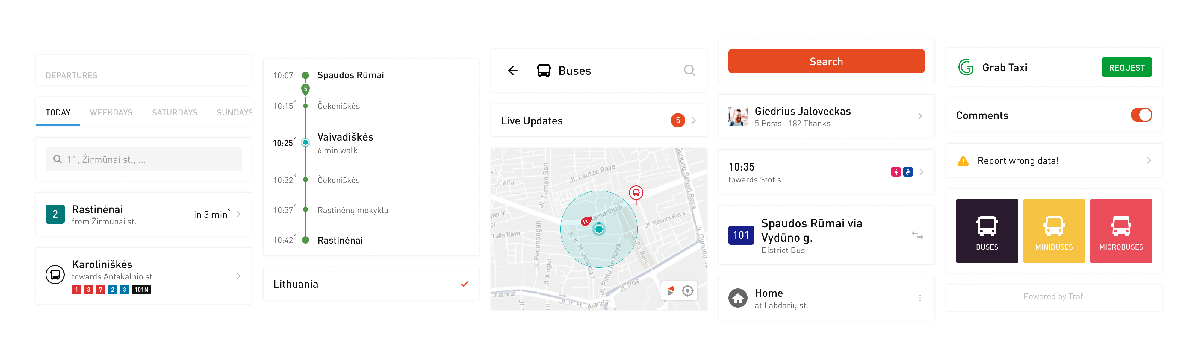
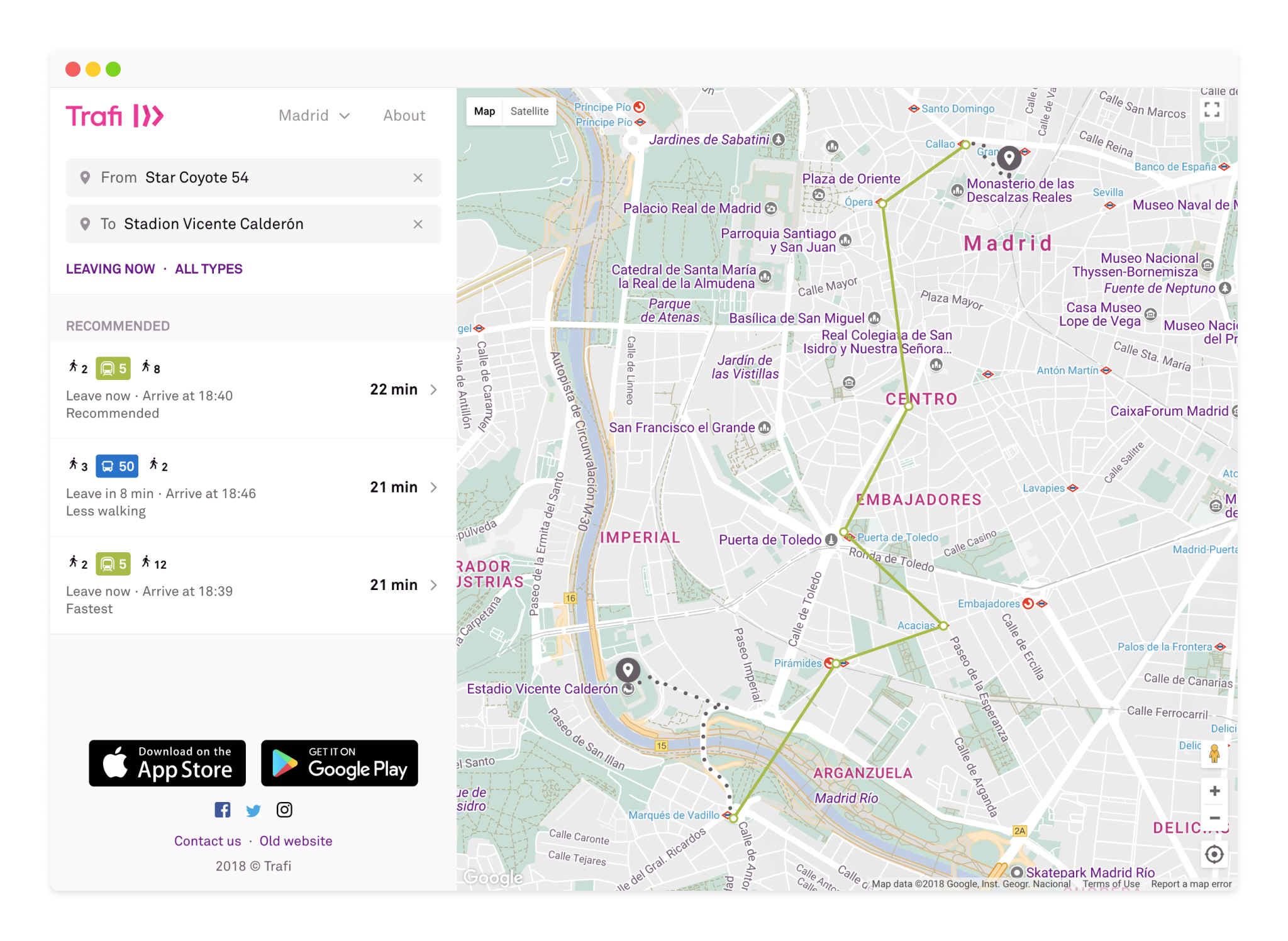
Home Screen
Suggesting a better way of moving within a city means, that we need to expose users to alternatives. Unfortunately, at Trafi use cases were separated by tabs, so exposure wasn’t easy and data proved that.
Once I've started working on research of this problem, I've come to the conclusion, that cross-promotion won't work. We need to create a modular home screen covering all major use cases, which could be easily adopted to each specific city and personalized to specific needs.
I've created several variations of a component for each major use case — interactive map, transportation cards grid, route search input, predefined search options, favorite tracks, newsfeed and we used the combinations of these components in interviews with our users, however, it was clear that A/B test will show different and, probably, more valuable information.
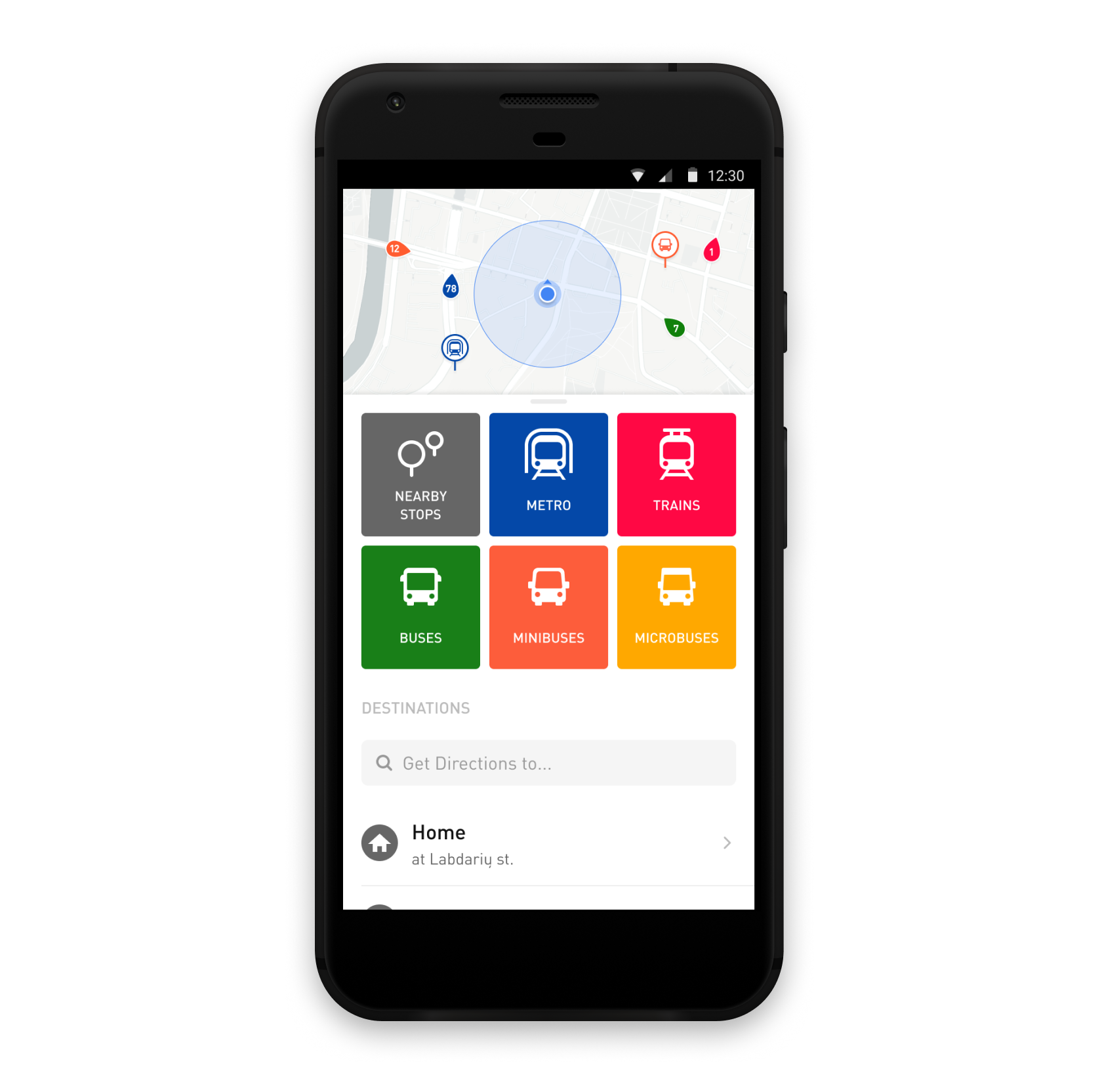
We’ve tested our assumptions by trying different layouts, hierarchy, and grouping, so it took my team nearly 3 months to release the final version of Home screen. But results were better, that we’ve expected — transport types discovery skyrocketed, retention grew and the usage of “Home” and “Work” shortcuts increased.
This success was a perfect motivation for me to start focusing on remaining problems.
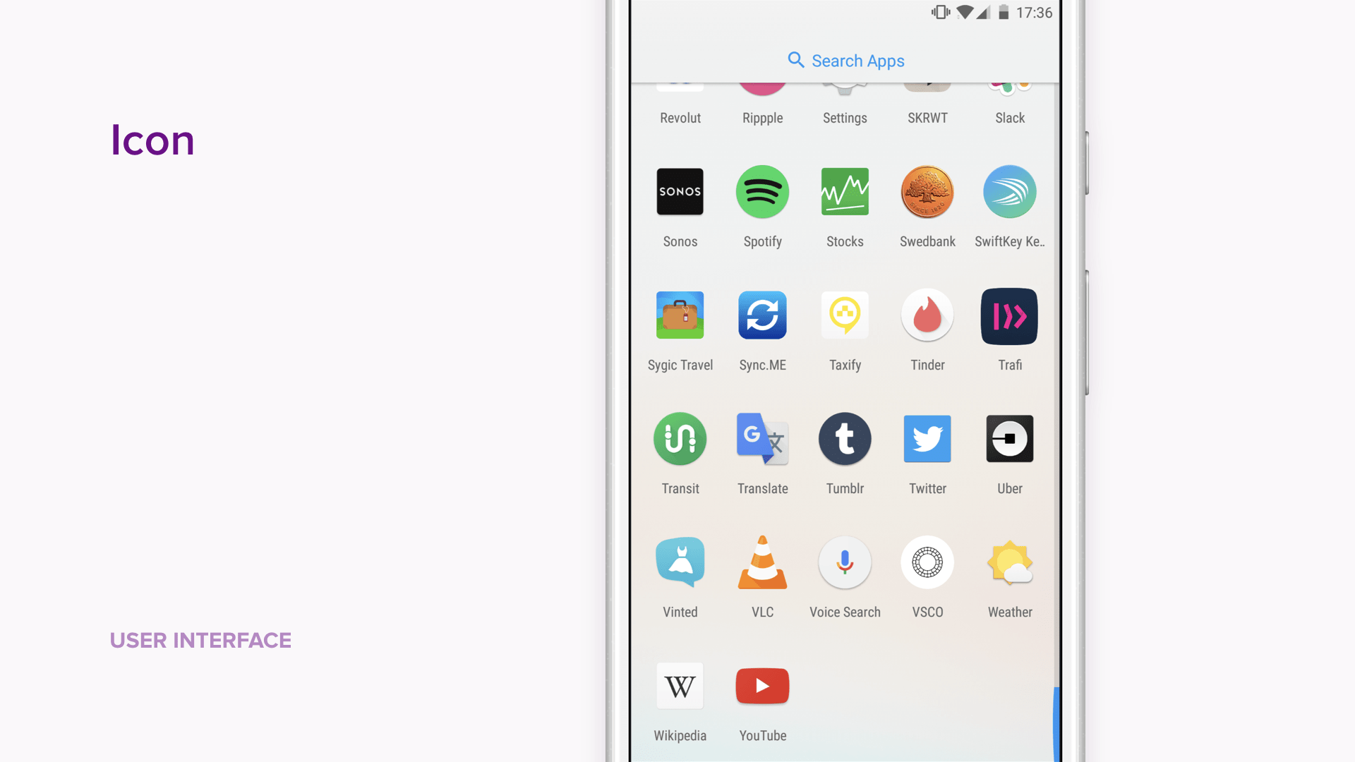
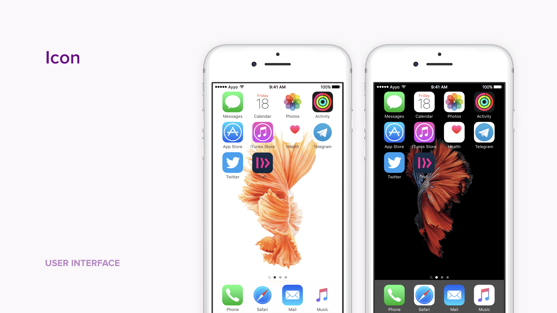
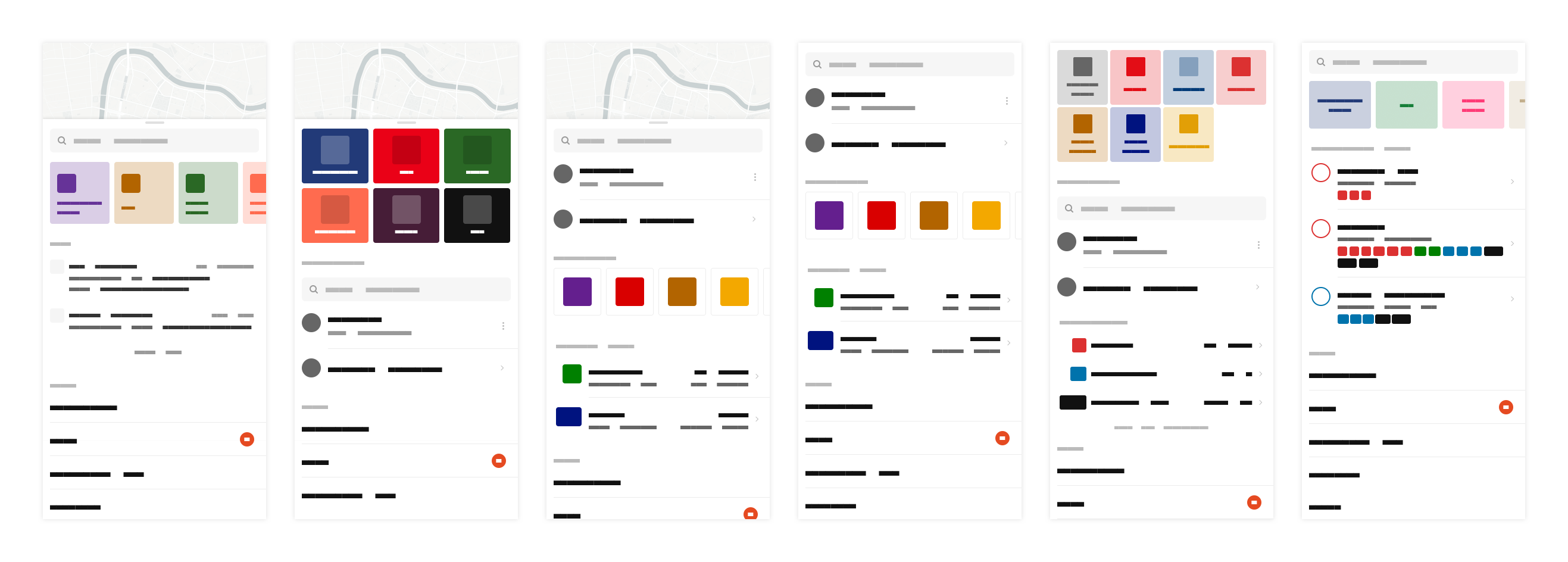
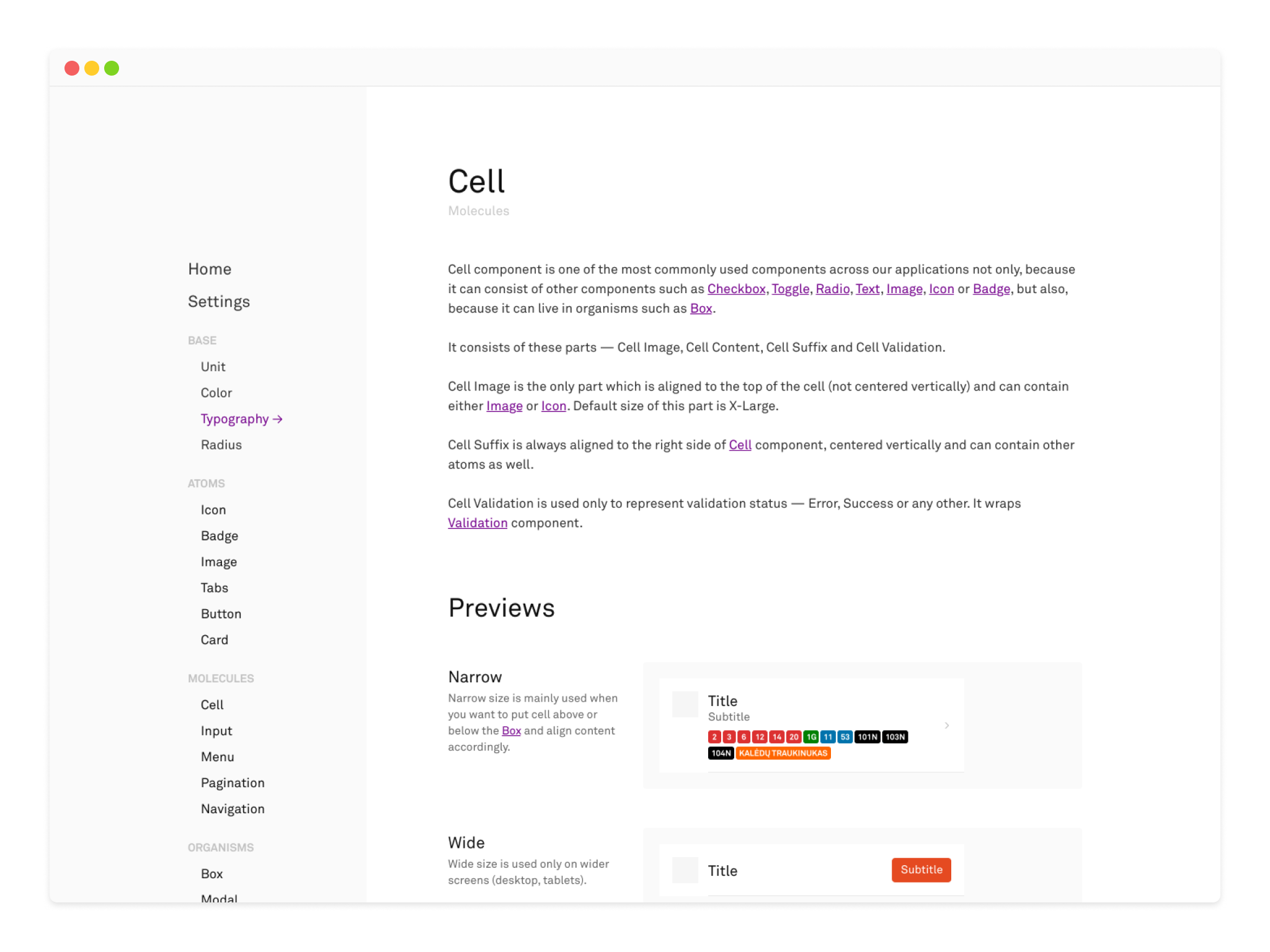
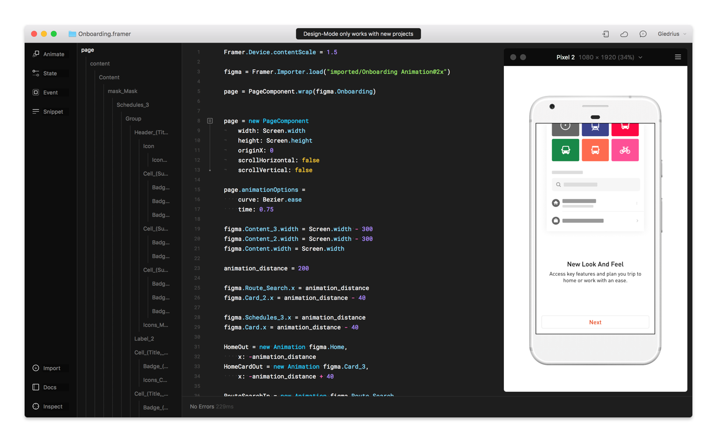
Design System
As most of the information entities were already built around unique components (stop, schedule, track, vehicle), the next step was to build a design system, which would allow me quickly iterate on recomposition and improvements of remaining screens and flows.
I’ve started with an audit of current screens and UI elements by fleshing out variations of atoms and molecules. It helped me to understand what kind of constrains the design system should have — sizes of texts and icons, colors palette, the exact list of components and their properties.
Of course, by focusing on small components and not the screens or flows, you might lose the grasp of the whole experience, so it was crucial to test newly created components as early as possible and, if needed, switch back to improve or totally rework them.
Also, the goal of the design system is not only to make the experience more consistent by fabricating the constraints for your design, but to improve the quality and speed of design-to-development processes. For this reason, I’ve created a single source of truth — a design system page for designers and developers, so everybody could share the vocabulary and constraints of the system. It also, allowed my team to start more close collaboration by involving everyone in design system creation and maintenance.
While building design system, I also needed to keep in mind, that we will adjust it for the upcoming brand update — the typeface, font sizes, colors, and illustrations will definitely change. However, having done the same process at VintedVinted — Case Study, I was sure we will succeed!
Rework of the Whole Flow
Once the basic components were ready, I was able to start working on improvements to the remaining screens and flow itself, while in parallel, adding needed components into our design system.
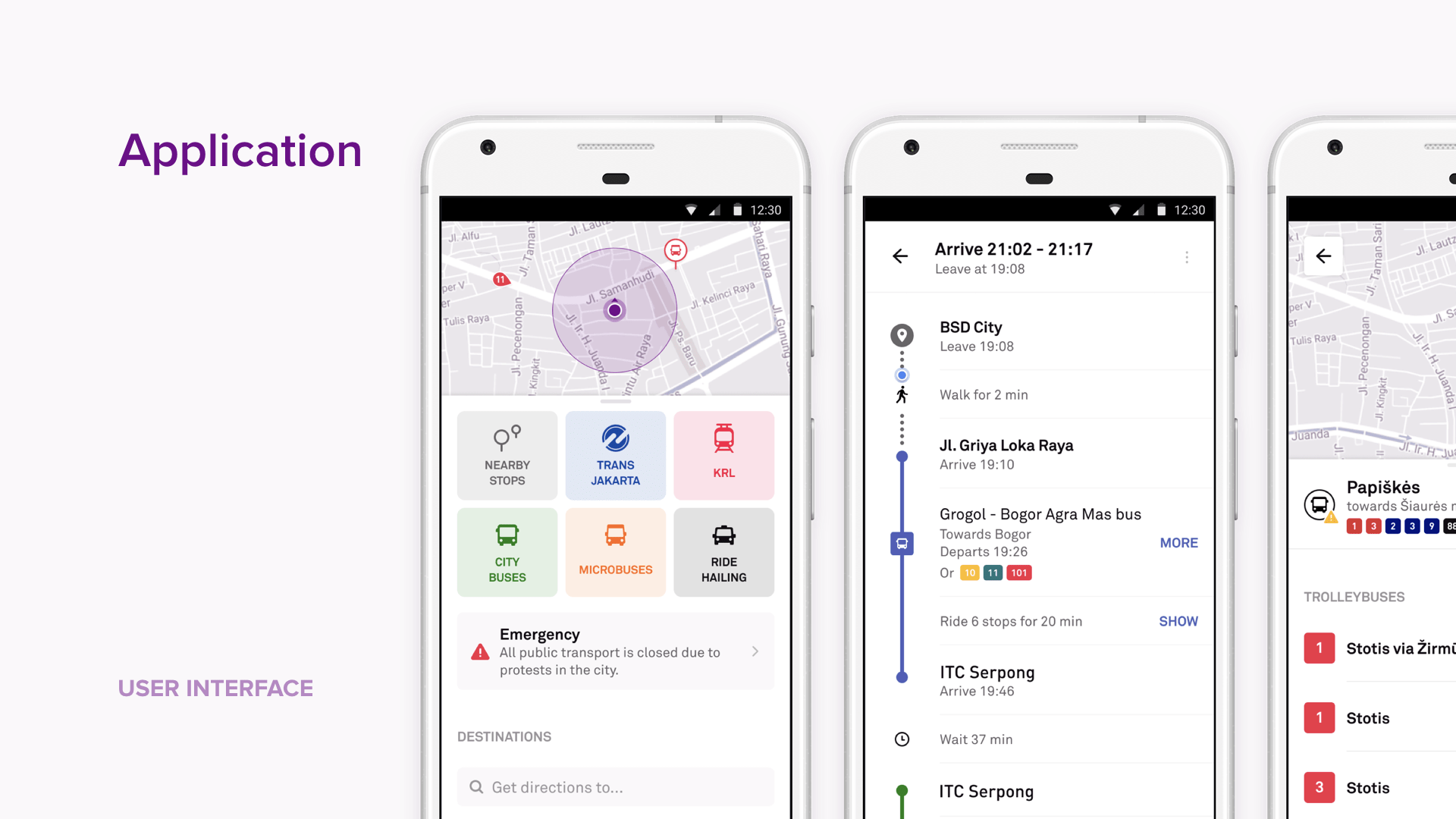
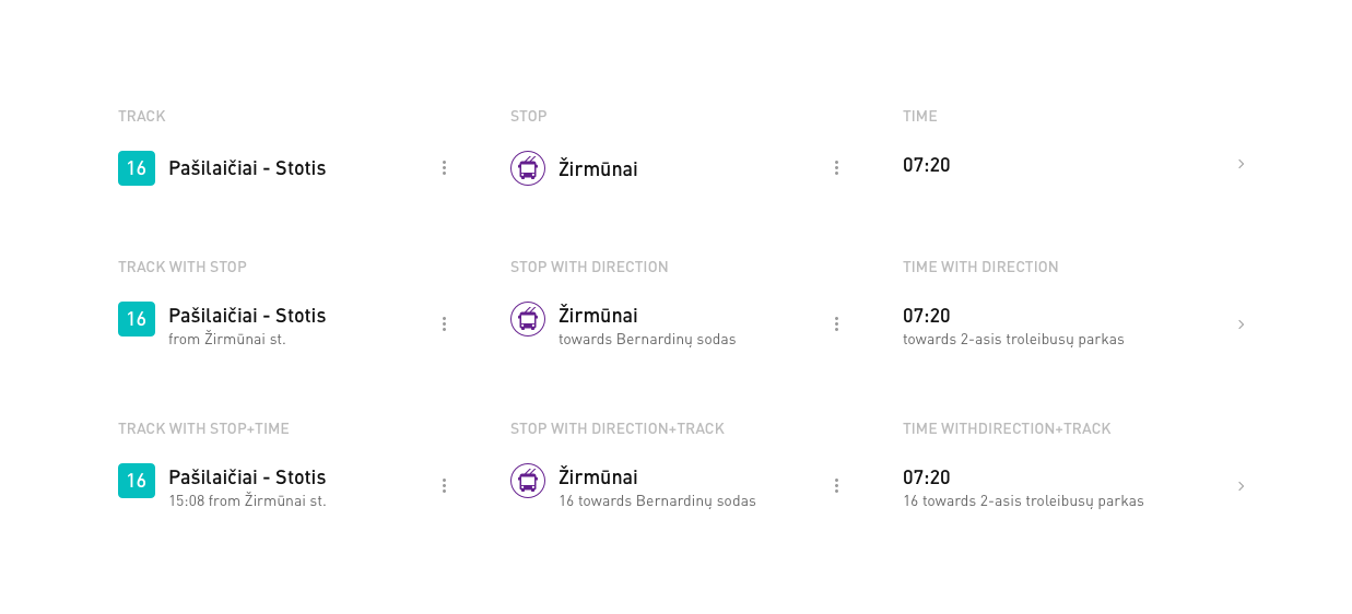
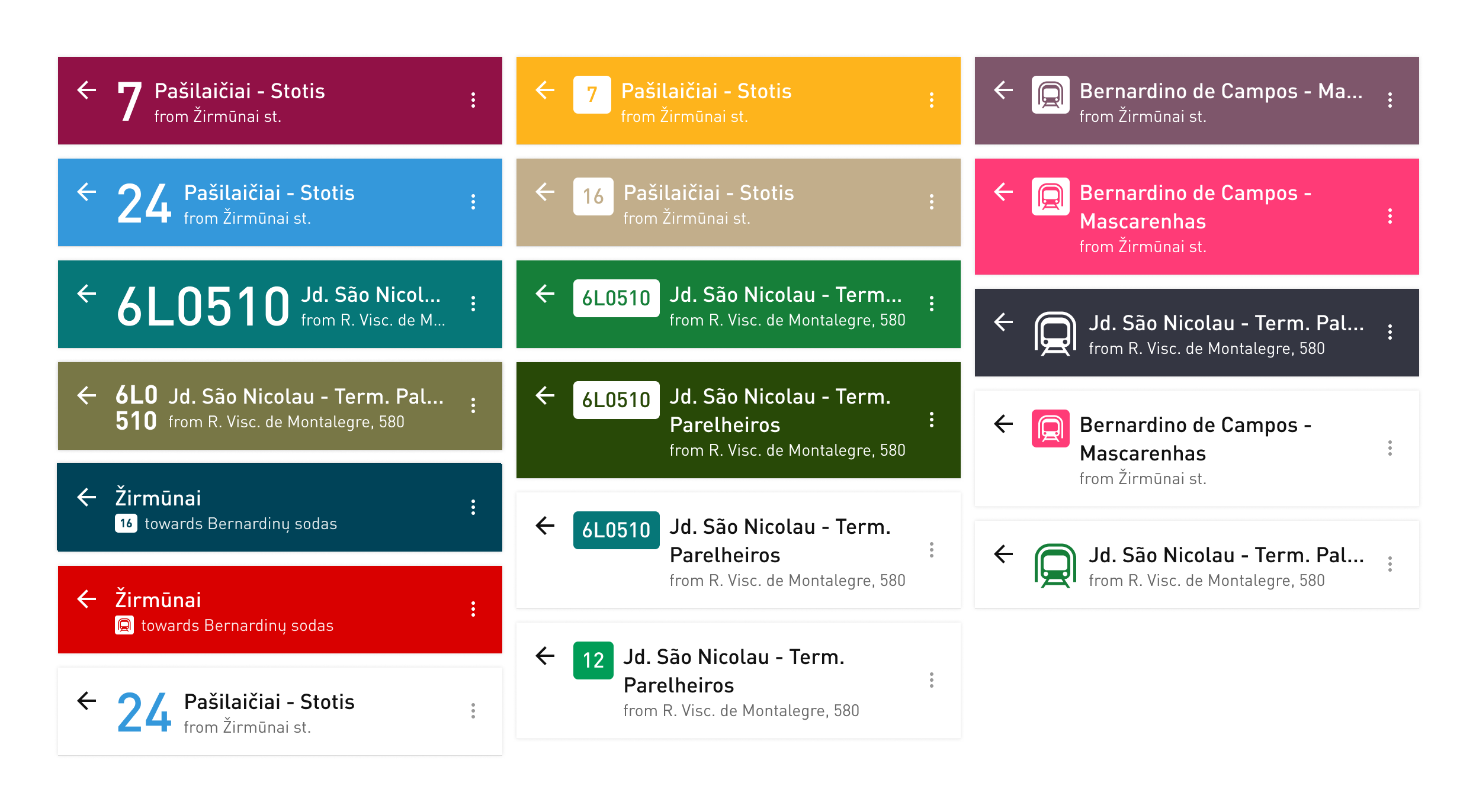
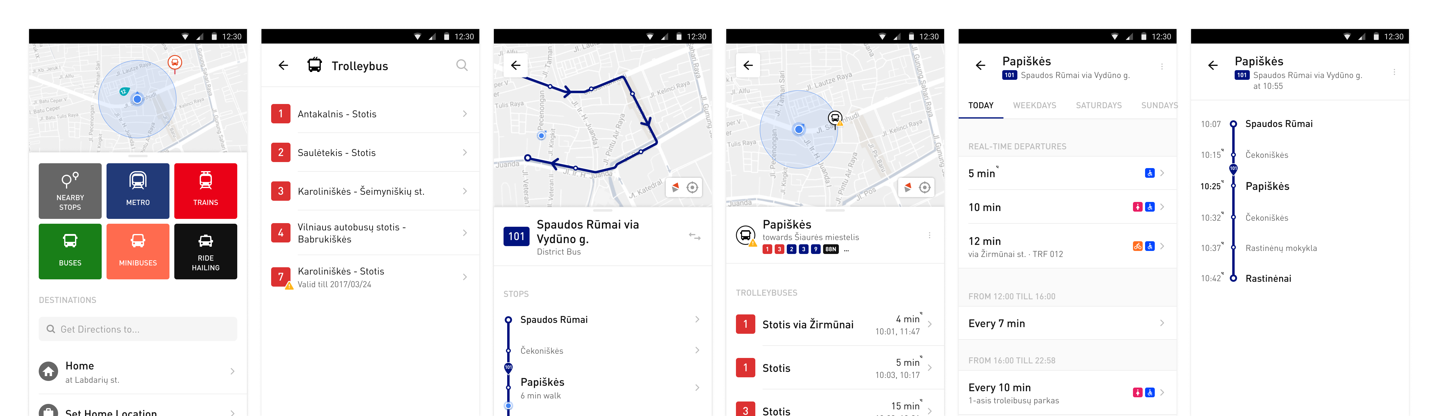
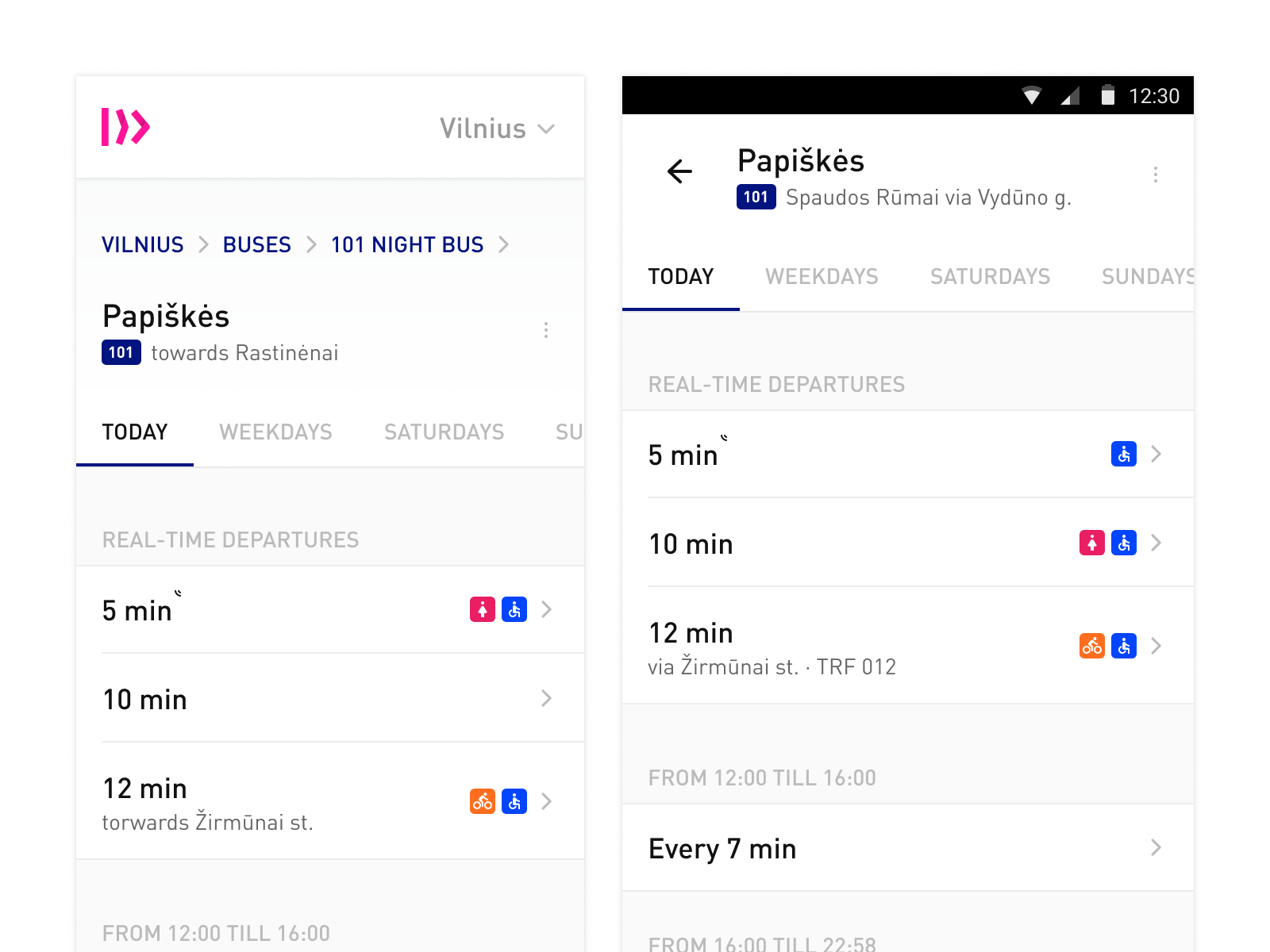
In Stop screen, I’ve separated transportation by type, as in single list most frequent transportation type often overwhelmed remaining ones. Also, instead of just listing upcoming schedules repeatedly (that’s how most schedule screens usually work), I’ve grouped them by specific track and sorted by time. Users were able to see the list of all possible tracks, not only the several upcoming ones.
Instead of having times table, which doesn’t work with a combination of frequencies or specific times, I've designed a regular list with a separate part dedicated for upcoming times. It meant that each row could now contain additional information such as direction or onboard facilities.
Specific Track screen now included simplified direction toggle, as fifty percent of the time users needed to change it. I’ve also redesigned track line with all possible stops along its way, and the one user is nearest to.
I’ve also improved transport list and search — results were now grouped by transport type.
Even though we knew, that it will take some time until all screens will be consistent, we've rolled out updates of these screens separately. It was easier to test, measure the impact and fix if something went wrong.
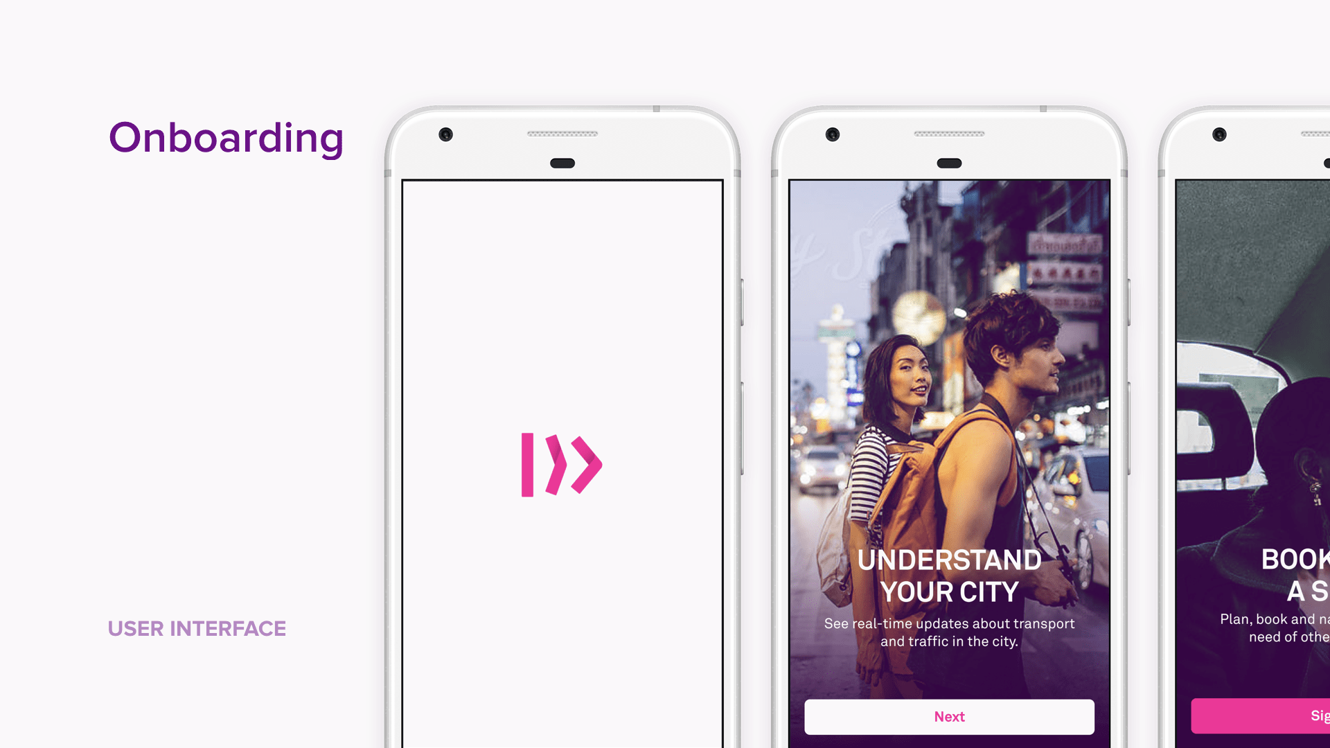
Onboarding
Trafi is utility application, so even the slightest change in user experience rises lots of questions from our users. Home screen update, as I’ve noticed from user interviews, wasn’t different, so for the global roll-out, we’ve decided to create an introductory onboarding.
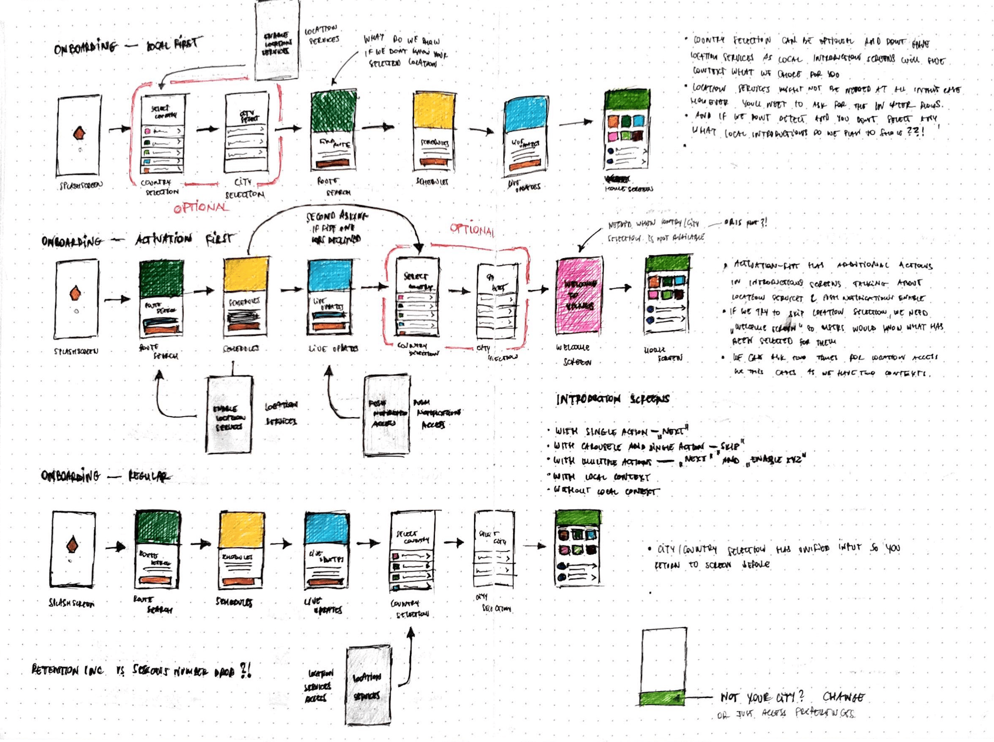
Apart from that, it was also a good time to rework first-time onboarding — flow where we explain what Trafi is all about, users select the city or/and we ask for location services permissions.
I’ve sketched several different approaches, but each of them had advantages and drawbacks:
- Local-first — we ask for location services permission or city selection in first two screens, so an explanation of Trafi functionalities can be more localized to the selected city. However, asking for permissions before an explanation of the service is, rather, problematic.
- Activation-first — we allow the location services enabling in explanation screens, however, it would require additional screen explaining, which city we’ve pre-selected.
- Regular — explanation first, then asking for location services permissions or city selection, however, we cannot localize it and we need to show, which city we’ve pre-selected.
After some iterations and testing, we’ve agreed to move on with the third option and release it under A/B test.
Unfortunately, as we looked at the data, first-time onboarding wasn’t improving our core metrics and there was a reason for that — most of our new users already knew what Trafi is.
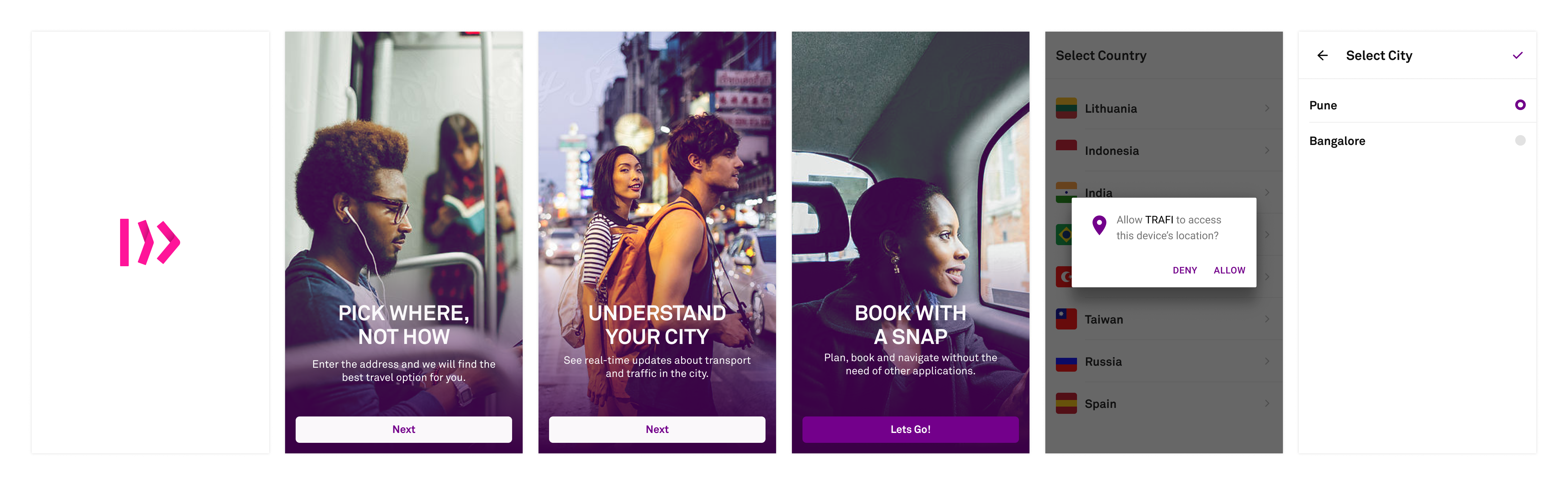
On the other hand, introductory onboarding showed some promising results — we expected a big drop of NPS score after the roll-out of Home screen, but it didn’t happen.
Anyway, we decided to release both of the onboardings.
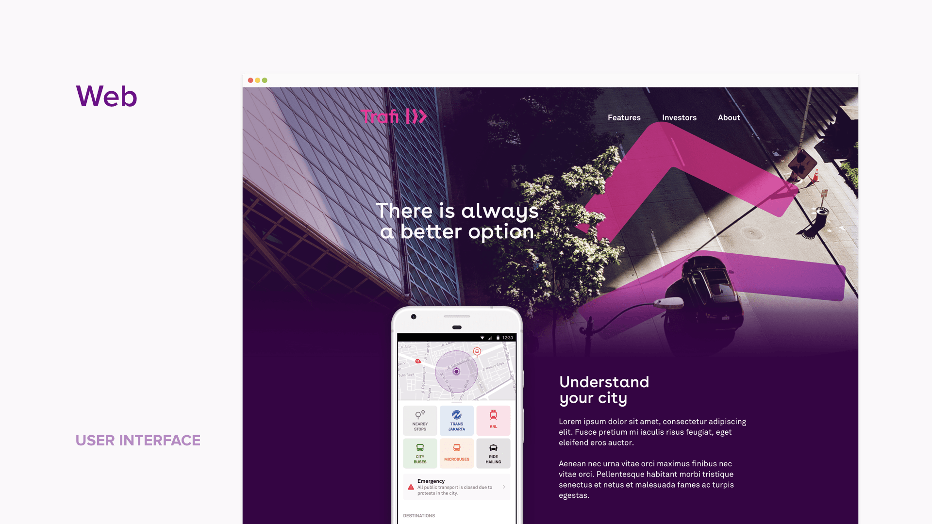
Web Experience
In early days, Trafi product was available only on the web. It had several major updates, but at the time smartphone revolution, it was abandoned as focus shifted to a mobile experience. However, as our target markets were mobile-web focused (India and Indonesia), it was crucial to reconsider and once again make Trafi web application our highest priority.
My idea was pretty simple — to recreate as similar experience a we have in mobile apps, both from user experience and functionality, and later adopt it for the desktop.
For the first version, our team decided to release an updated product only with schedules information and with no route search. Also, we skipped the personalization part — there was no possibility to access your profile, favorites or post comments in the feed.
The plan was to do soft launch as a beta version without public announcement, collect the feedback from our users and, once we’ve added remaining features and adopted experience for desktop screens, redirect all traffic from existing web products to the new one.
Global Brand
While I had some experience with branding projects from my previous work at Vinted, due to time constraints, we needed a help from experts on definition of the fundamental pillars for our company, mission statements, communication guidelines, as well as basic visual styleguide, from which I could prepare the extensive set of material for brand and application launch across all our existing and new markets.
For that, we’ve collaborated with amazing guys from Studio Kotostudiokoto.co, who had an opportunity to work on Airbnbstudiokoto.co/airbnb_trips and Fantastudiokoto.co/fanta rebranding projects. We’ve also asked Be&Dobeand.do team to help us with the brand strategy.
Having collected some data from user research and competitors analysis, I’ve prepared requirements for visual part of the brand:
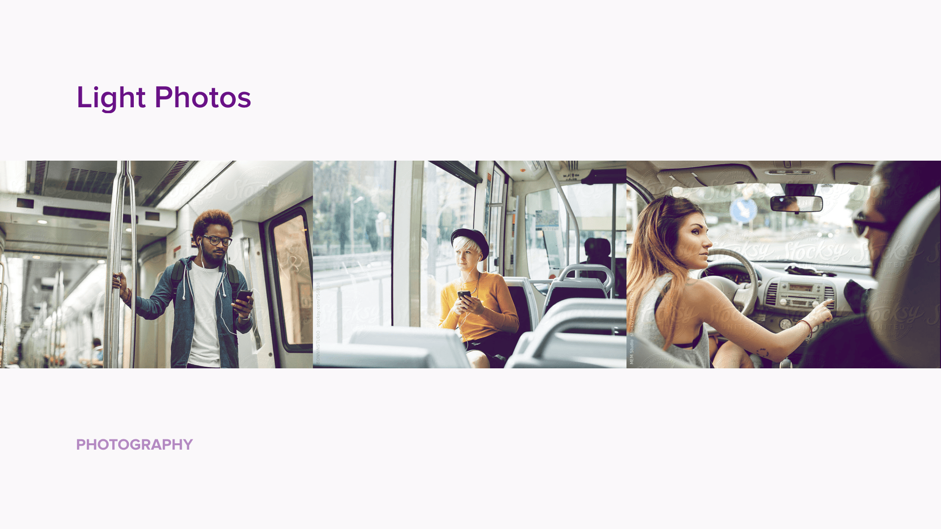
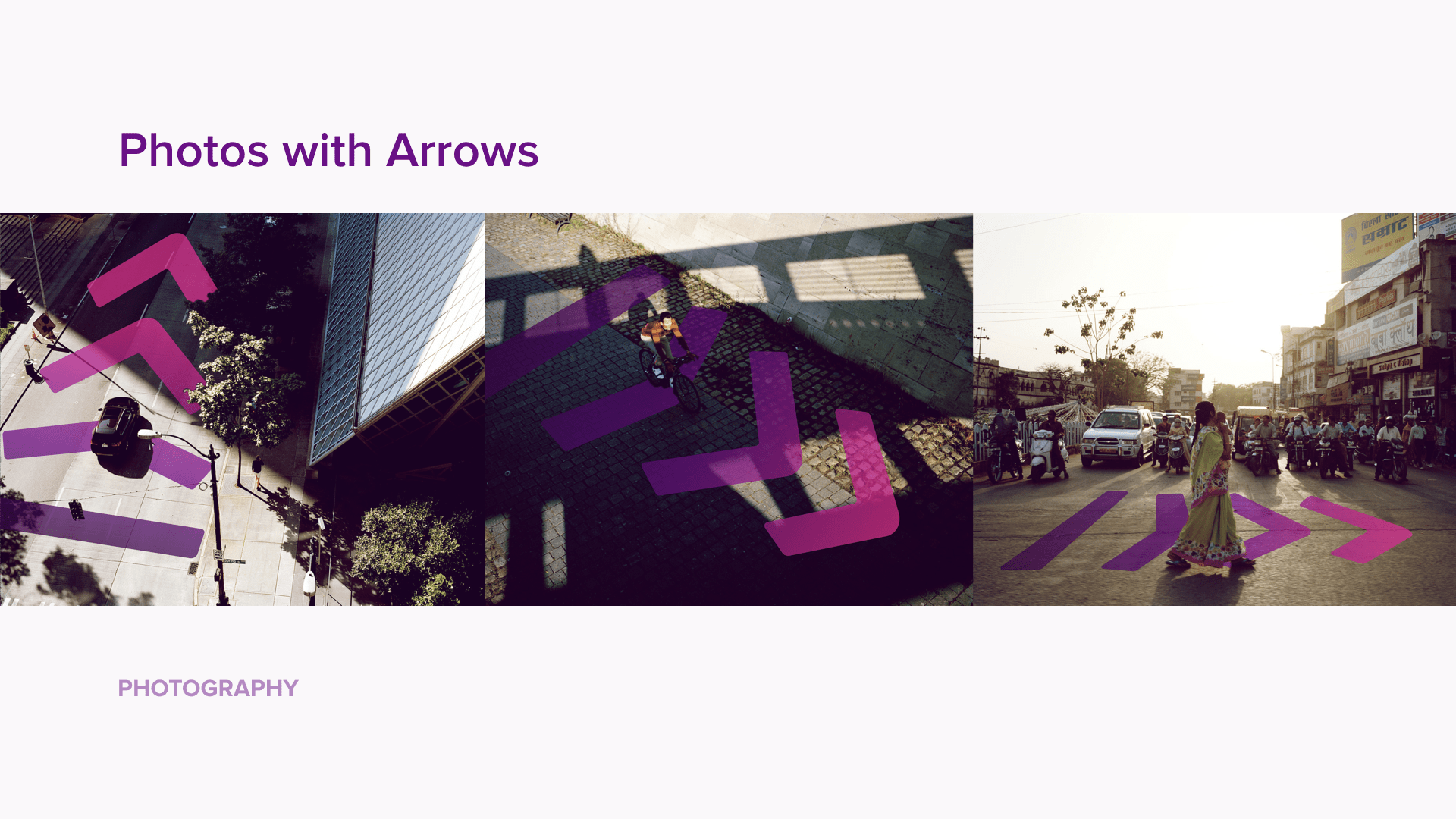
- Focus on photography instead of illustrations will both separate us from our competitors as well as make our brand feel more local. It will also contrast nicely with our text-heavy and icon-heavy UI.
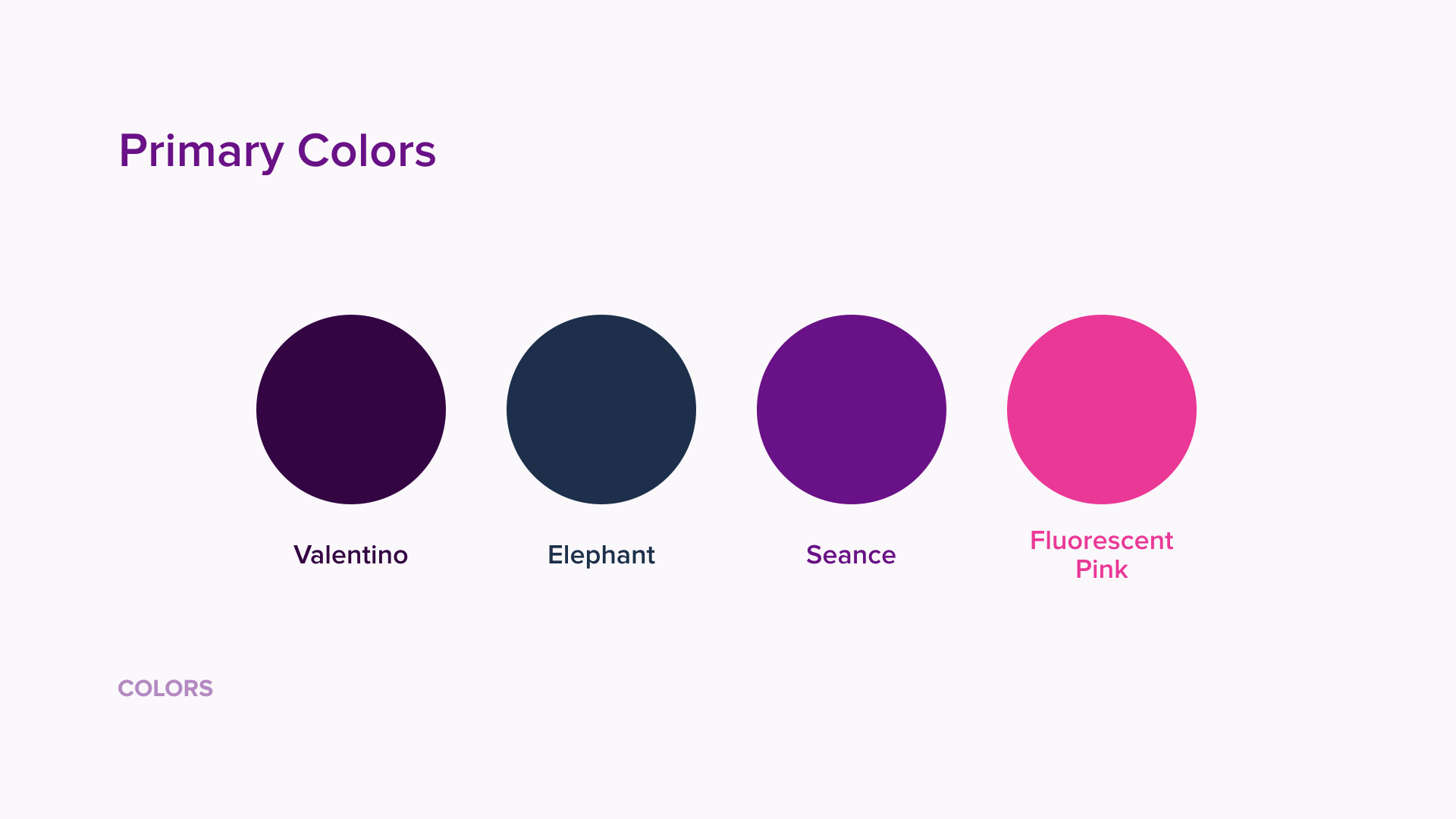
- The unique color palette will make our brand more noticeable in India and Indonesia and help separate Trafi brand from competitors and other transportation brands used in our products.
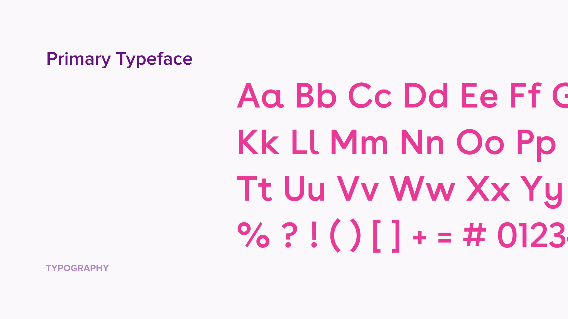
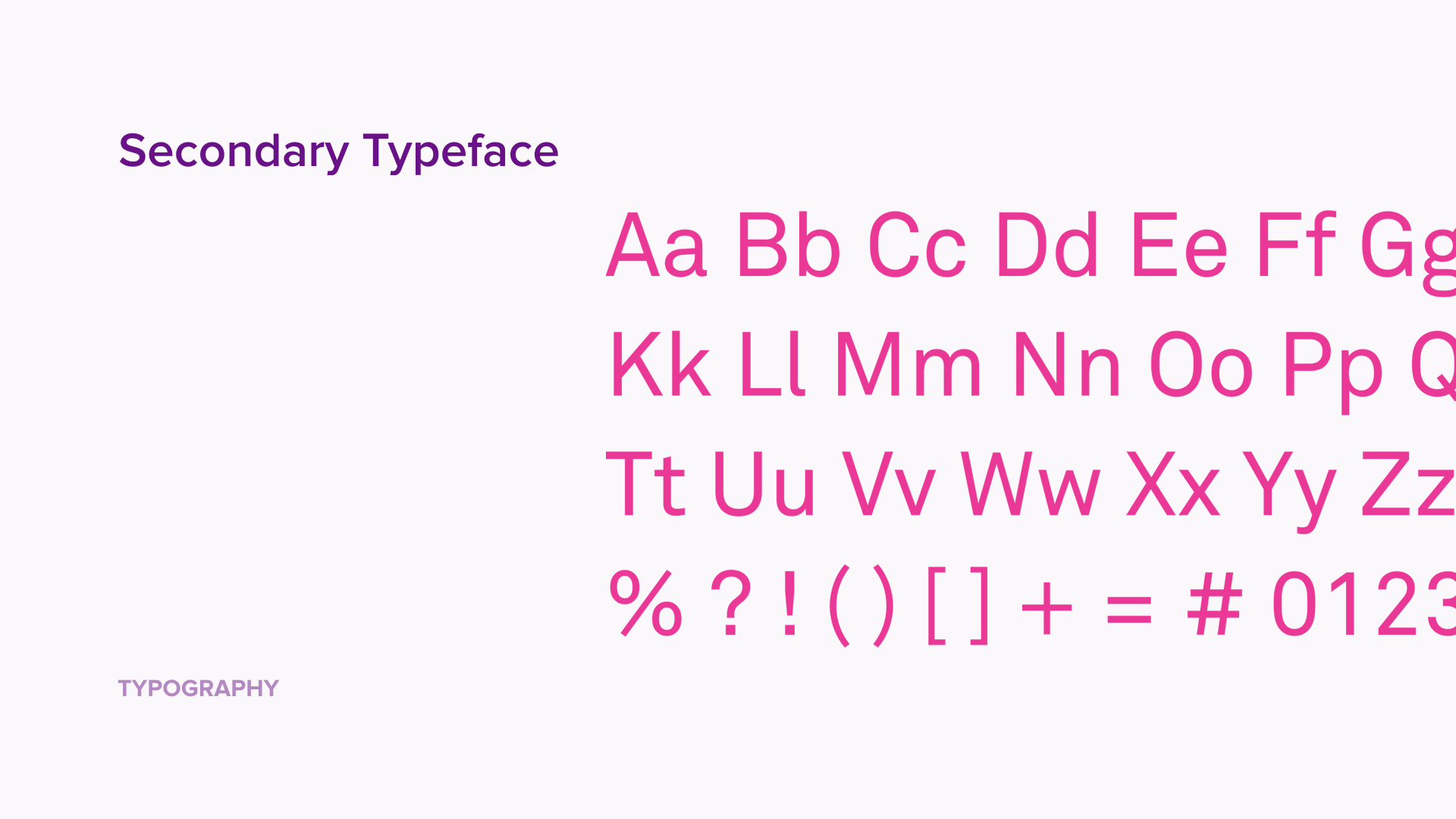
- Remarkably legible UI typeface which is slightly condensed and have great x-height will help us with information density in our product.
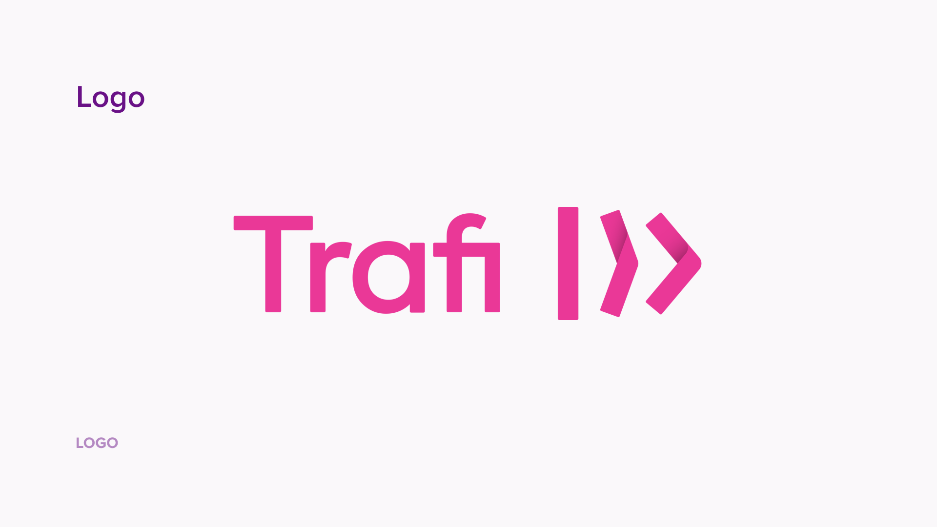
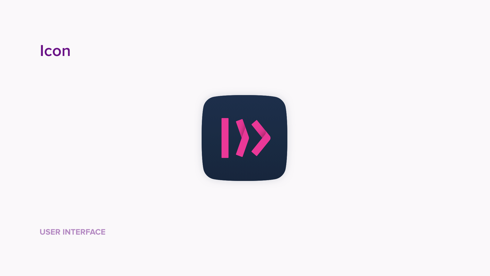
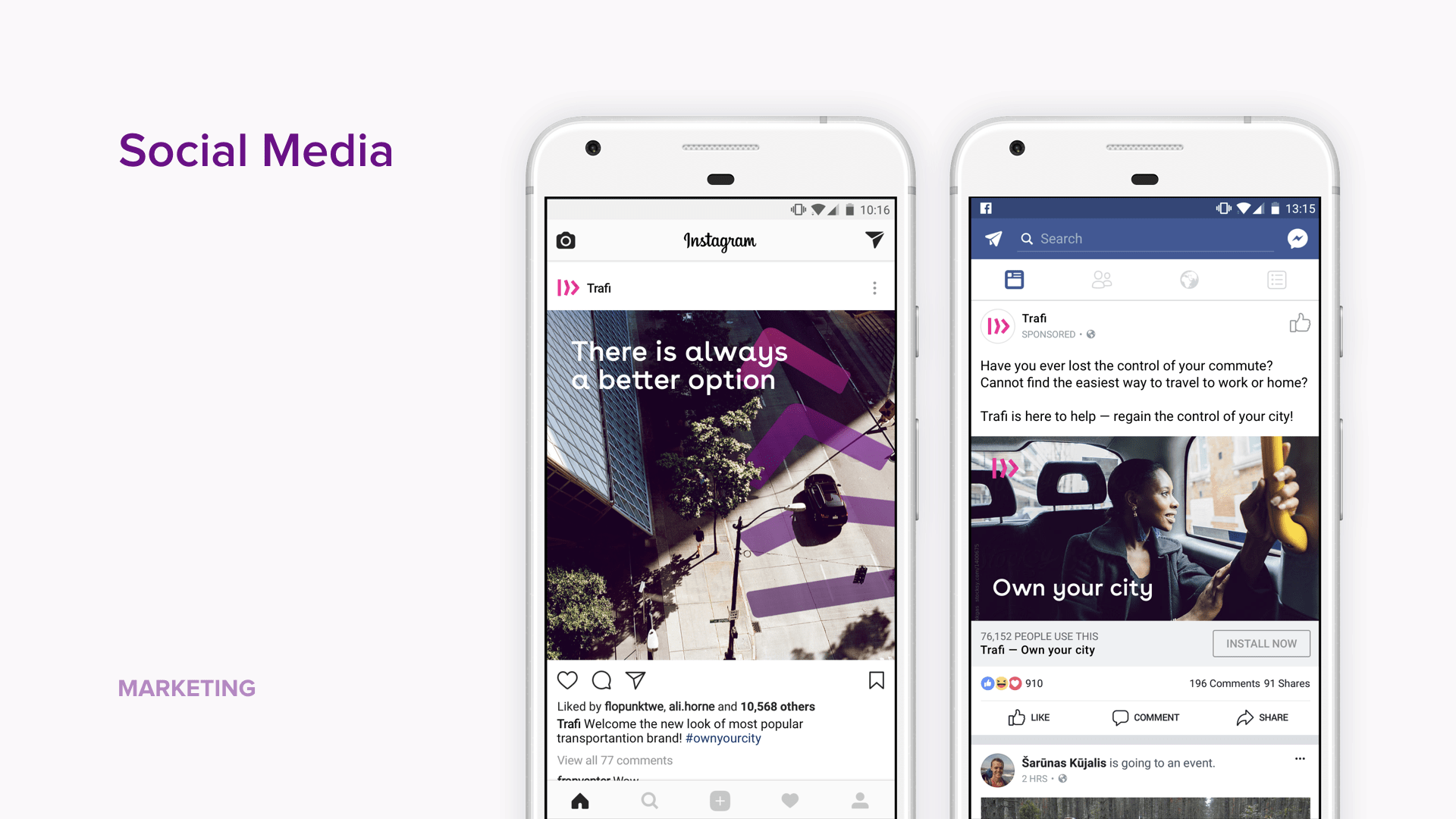
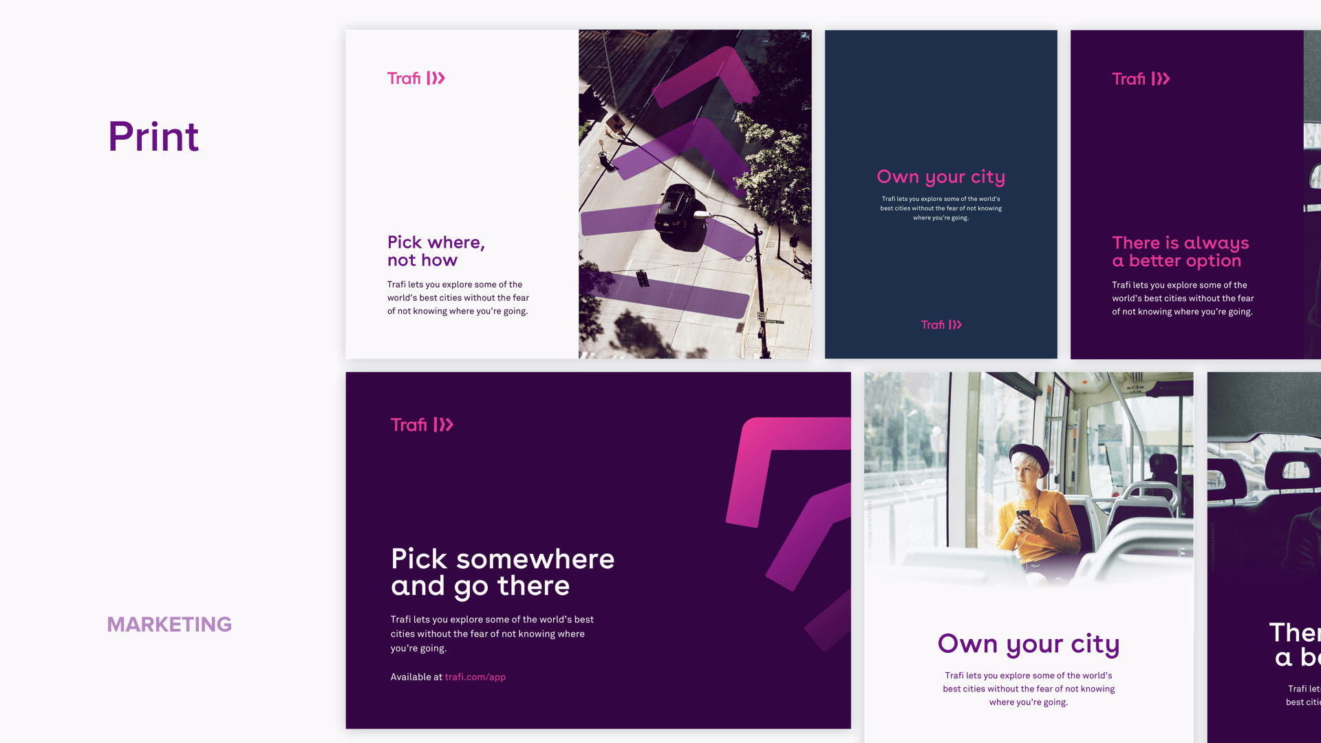
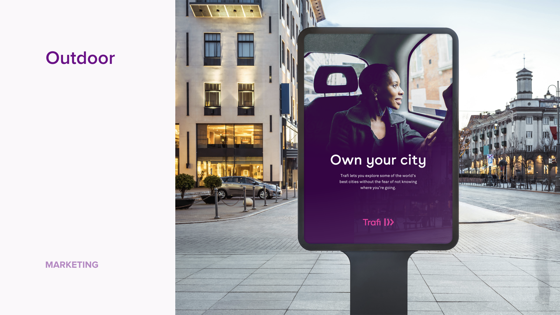
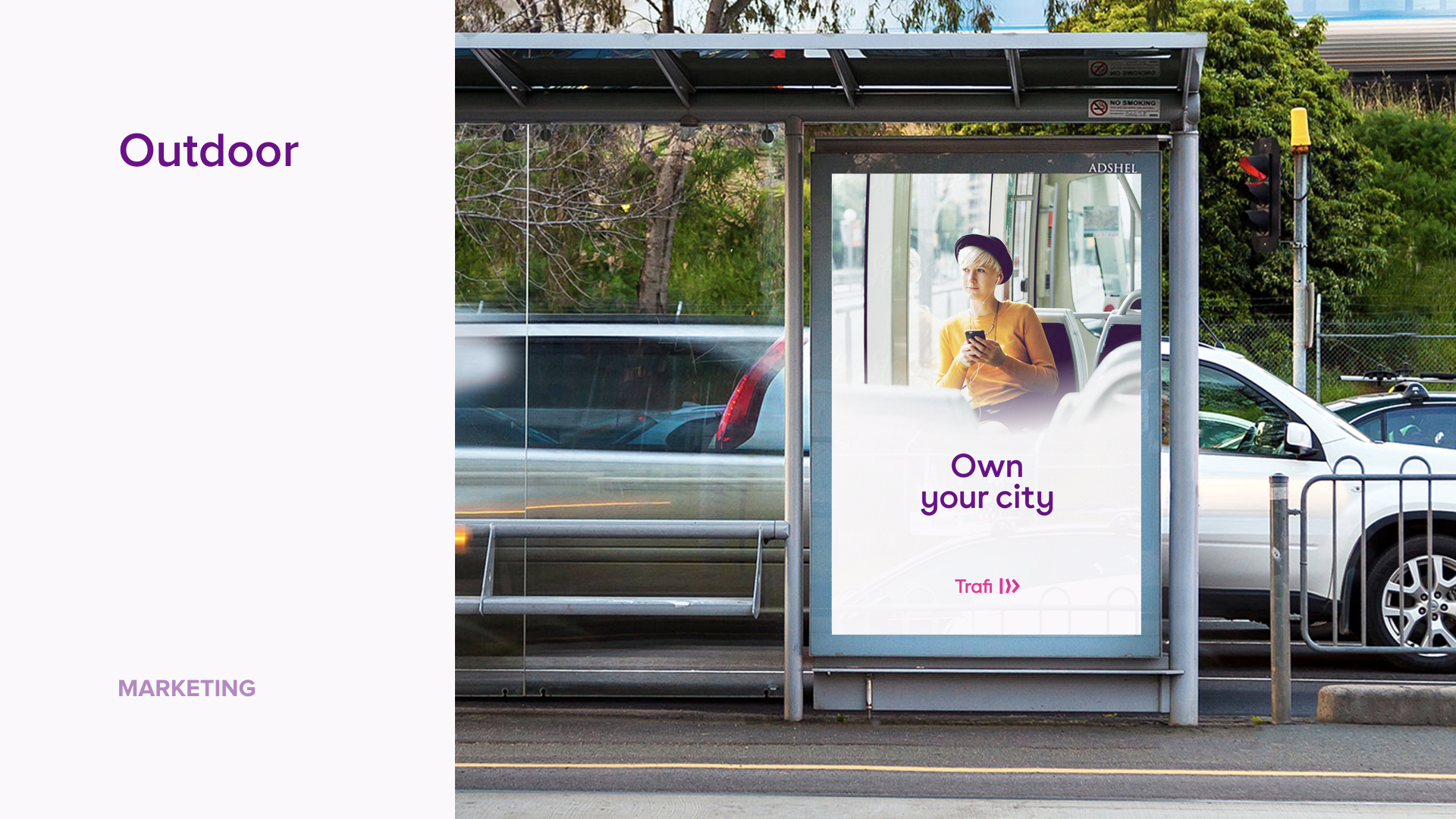
Couple intensive months of collaborative work between the studios, our branding team (Head of Brand, Head of Product and Myself) and co-founders of Trafi, and we’ve received final version of Trafi styleguide and brand strategy material — new logo representing the movement, bold but very unique color palette, new typeface pair, art direction examples, brand pillars and our new slogan — “Own your city”.
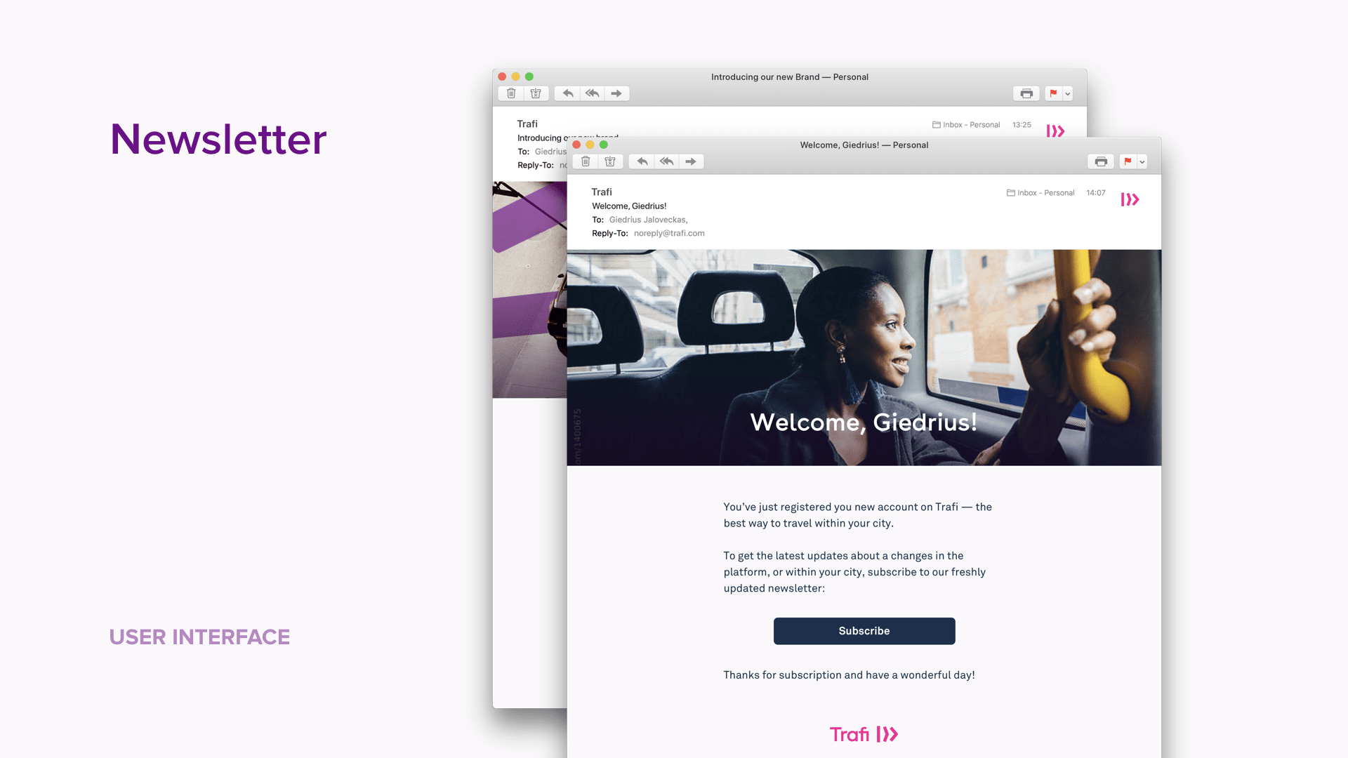
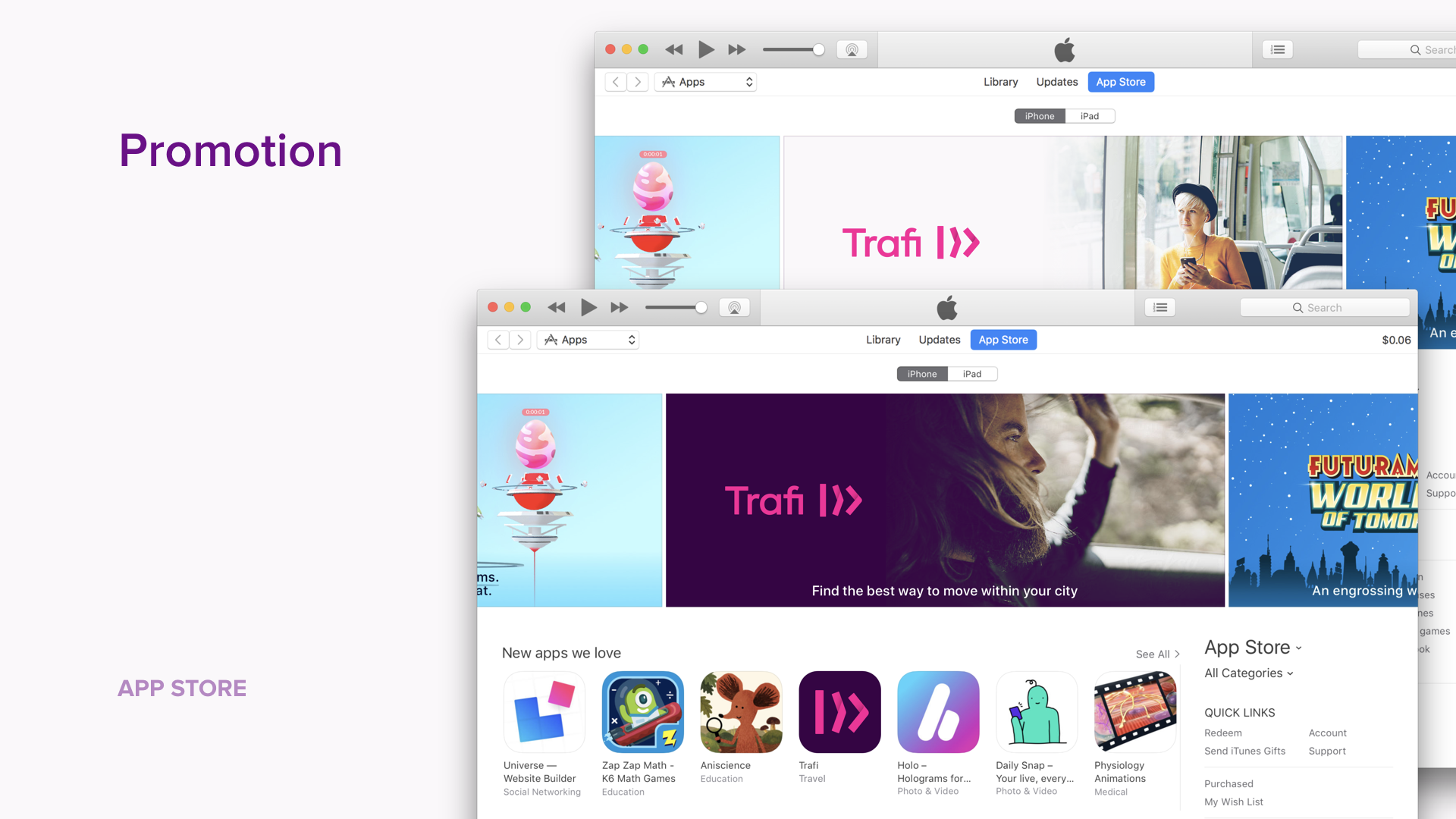
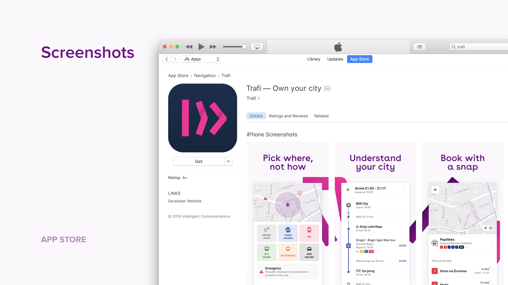
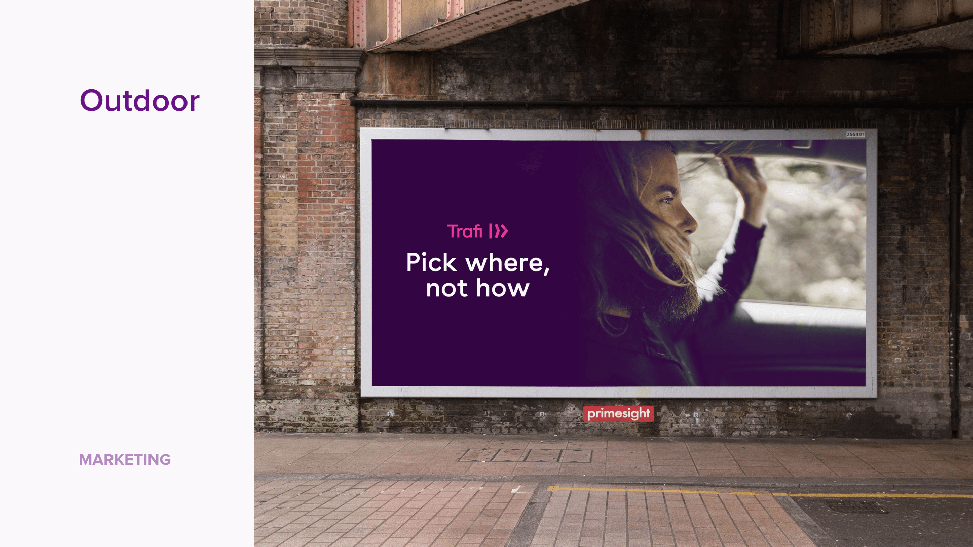
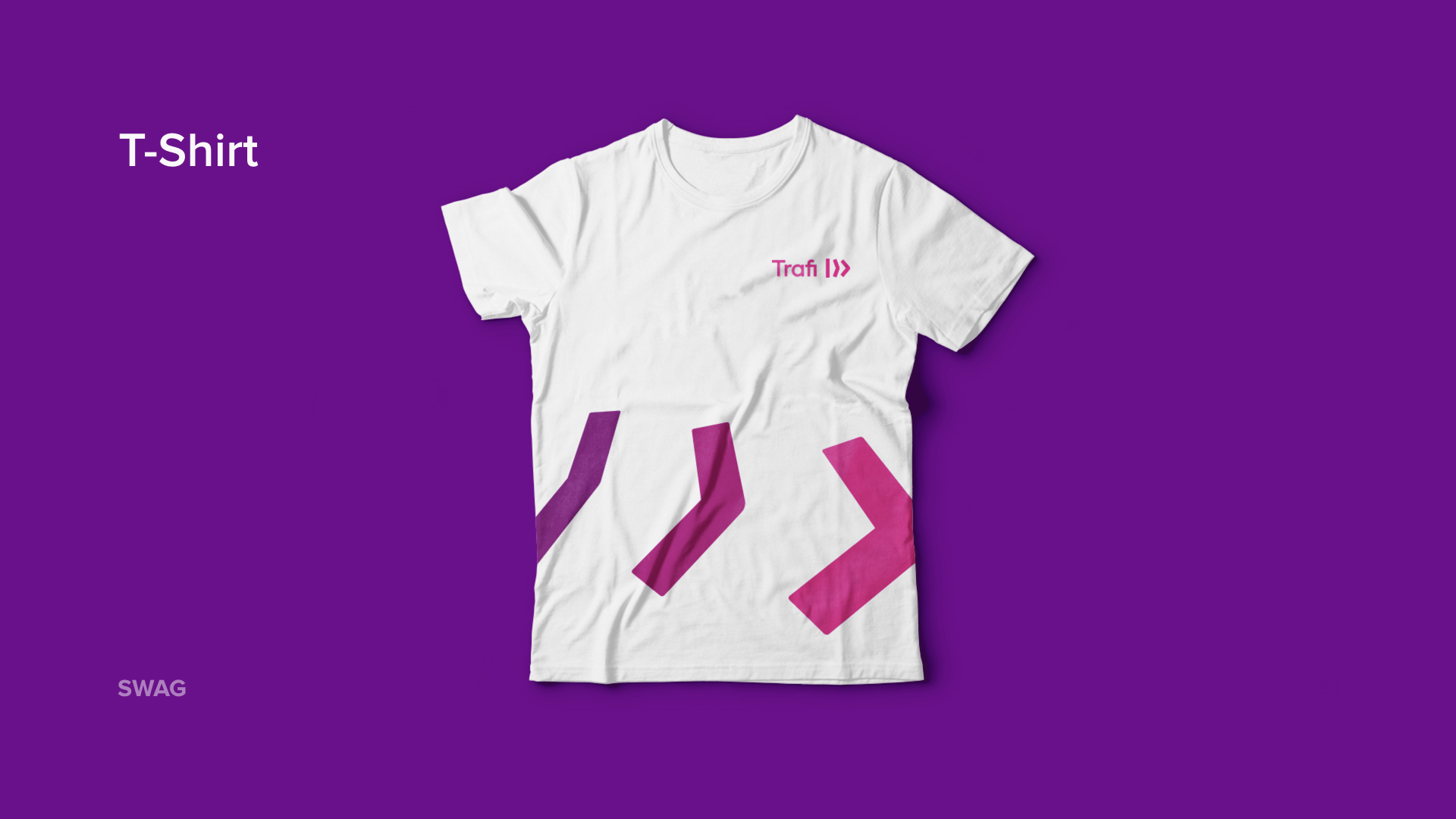
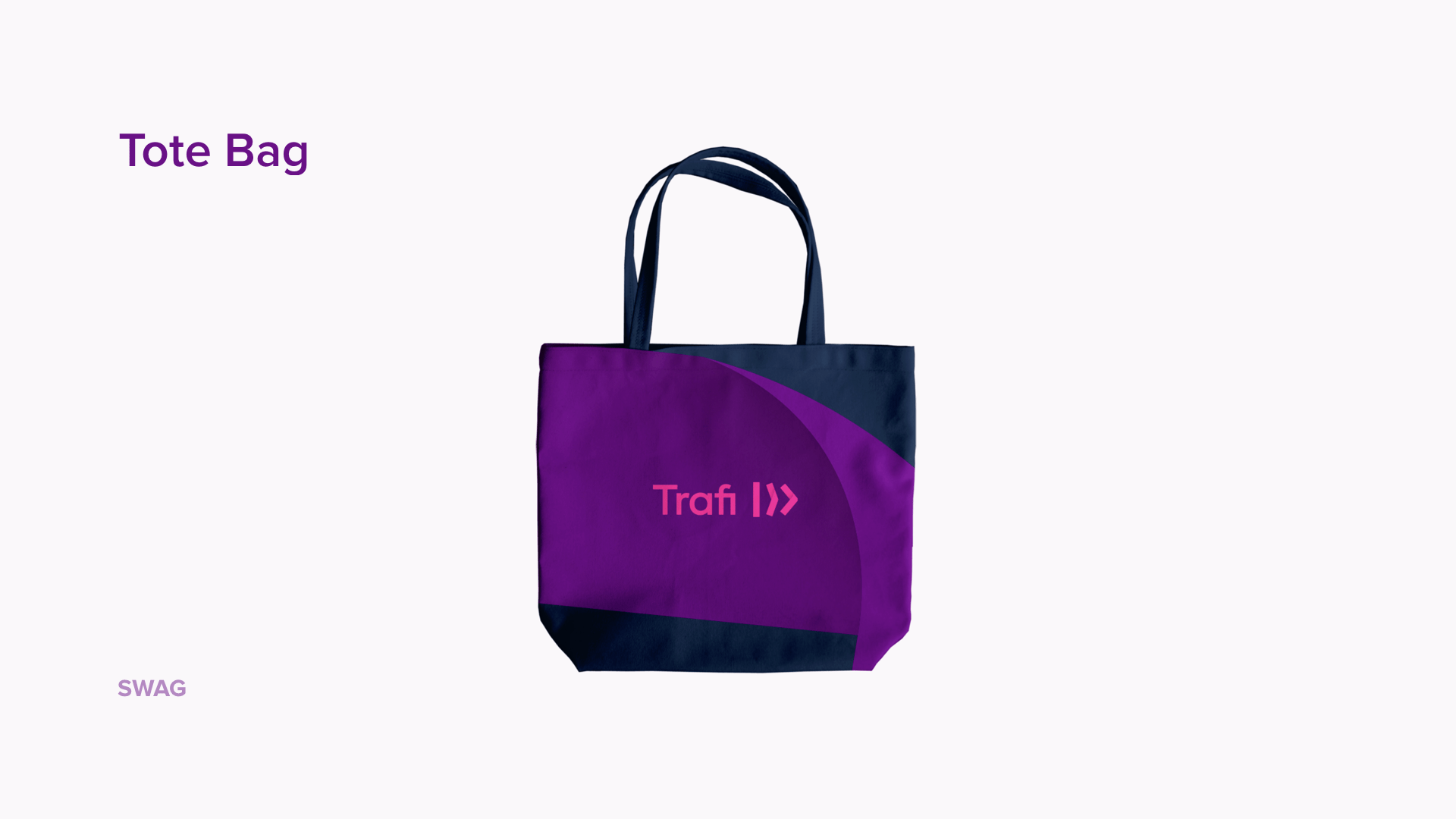
I’ve used all this material to produce the final visuals for apps, web, email, outdoor marketing, social media, and print:
Conclusion
I left Trafi just before the launch of new brand, however, the updated app already showed very promising results — NPS and retention reached all-time highs, organic growth started accelerating and the feedback from the users was ecstatic. There is still a lot of space for improvements, but I’m very proud, what our team achieved in this — highly collaborative and agile environment.
I'm using Trafi every day and, more importantly, I see more and more people using it every day, so it really helps to find the better ways of moving within a city!